• Welcome
  • Case study
  • Blog
  • Syndicate
  • Enquiry
Radka Advertising - Forward Thinking Advertising Agency
  • Welcome
  • Case study
  • Blog
  • Syndicate
  • Enquiry

3 Branding Lessons From Culinary Superstars

Call it the curse of celebrity: When your personal brand rises so high, it overshadows your creations. This isn’t a problem for some of the world’s biggest entrepreneurial chefs.

Speaking at an Advertising Week panel discussion the other day called “Chefs as Brands,” Mario Batali, Dominique Ansel and Daniel Boulud didn’t spend time complaining about their name recognition. Instead, the culinary superstars--accompanied by moderator Adam Sachs of the Tasting Table--praised the notoriety as an opportunity.

“The brand should be an extension of yourself,” says Ansel, owner of the eponymous New York City-based bakery and the creator of the famed cronut. “It should be completely your personality and what you believe in.”

For Boulud, the owner of various restaurants across the country including Café Boulud in New York and Bar Boulud in Boston, entwining your personal brand with your business can pay dividends. “It’s an advantage to have your name give you business.” He adds that every aspect of a restaurant and brand is personal--and it should be. “We’re each our own personal entity. Our brand should reflect who we are and what we believe in.”

Still, growing a restaurant into a food empire requires more than a larger-than-life personality in the kitchen. Here are their top growth tips:

Know when to say ‘no.’ A chef can’t be in more than one kitchen at once. “I don’t go to every meeting or worry about every little thing,” says Boulud. “But I am in constant contact with the chef all the time.”

Hire well and delegate. For Batali, every employee has something to bring to the team, and he wants to harness that. “With 2,400 employees comes an incredible wealth of talent looking to get involved,” says the cookbook author and restaurateur. “It means I don’t have to be the smartest person in the room all the time.”

Seek efficiencies. This doesn’t mean that he talks to every single one at the same time, though. “I like meetings of three or four people,” says Batali. “That’s where I do my best work.”

But let’s be real here: If the food wasn’t any good, any amount of branding--be it personal or otherwise--wouldn’t help much. Food is what truly sells a restaurant. “Regardless of trend or fashion,” says Batali. “What transcends everything else is the cuisine.”

Questions / Enquires - hello@RadkaAdvertising.com

tags: branding, design
categories: branding
Thursday 12.22.22
Posted by Bart Radka
 

When Information Design is a Matter of Life or Death

In 2008, Lloyds Pharmacy conducted 20-minute interviews with 1,961 UK adults. Almost one in five people admitted to having taken prescription medicines incorrectly; more than eight million adults have either misread medicine labels or misunderstood the instructions, resulting in them taking the wrong dose or taking medication at the wrong time of day. In addition, the overall problem seemed to be more acute among older patients.

Almost one in five people admitted to having taken prescription medicines incorrectly; more than eight million adults have either misread medicine labels or misunderstood the instructions.

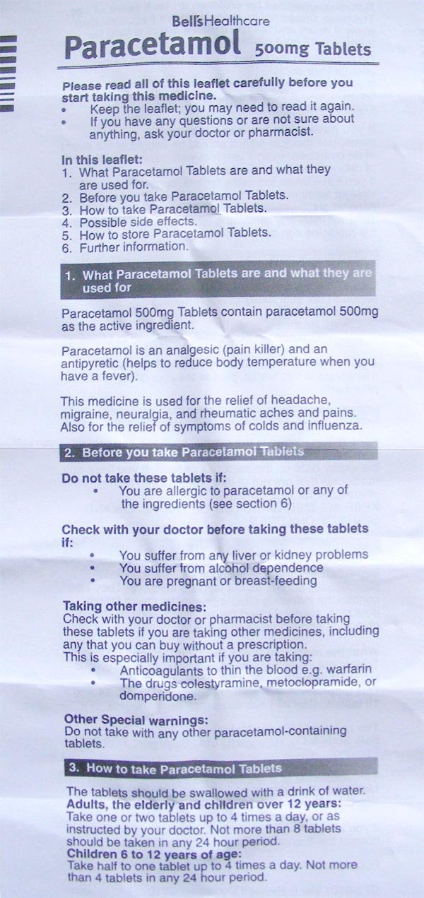
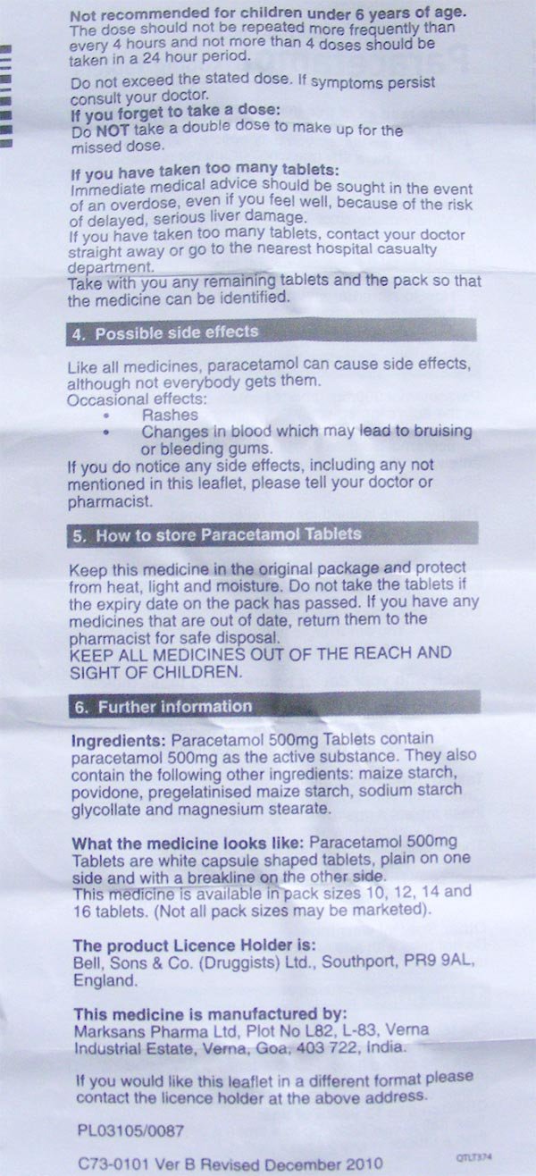
Medicine or patient information leaflets refer to the document included inside medicine packaging and are typically printed on thin paper (see figures 1.1–1.4). They are essential for the safe use of medicines and help answer people’s questions when taking the medicine.

If the leaflet works well, it can lead to people taking the medicine correctly, hopefully improving their health and wellness. If it works poorly, it can lead to adverse side effects, harm, or even death. Subsequently, leaflets are heavily regulated in the way they need to be designed, written, and produced. European and individual national legislation sets out the information to be provided, in a specific order, within a medicine information leaflet.

image-asset.jpeg
image-asset (1).jpeg
image-asset (2).jpeg
image-asset (3).jpeg

Adding to the design challenge is the fact that the guidelines for how medicine information leaflets are designed to change from country to country, and the guidelines are often vague.

One of the changes in the 2004 European Commission directive was to ensure that all medical information leaflets ‘reflect the results of consultations with target patient groups.’ In other words, when producing a leaflet, user testing (or ‘readability testing’ as it is also known) must be done. A satisfactory test outcome is when the information requested within the package leaflet can be found by 90% of test participants, of whom 90% can show that they understand it.

The diagnostic testing method for medicine information leaflets also raises a unique challenge when designing leaflets and is more rigorous than the level of user testing most designers are used to.

Additionally, medicine information leaflets are required to be reviewed and approved by a competent authority, which varies from country to country, before being included in the packaging with the medicine.

Possible Design Improvements

How can these materials be designed so that people end up taking the medicine as directed?

One issue with medicine information leaflets seems to be that most people do not read the document from start to finish, although it contains important information. Reasons for not reading or only skimming the leaflet from start to finish could be due to the amount of information or the leaflet design.

Competing sources of information introduce additional confusion. Sometimes the pharmacist will attach to the packaging a sticker with dosage instructions. That sticker can cover the dosage instructions printed on the packaging itself.

There are now potentially three sources of dosage information: the sticker, the packaging, and the leaflet, all with different densities of information. This creates an assumption on the part of the patient that everything they will need to know will be on the sticker–a dangerous assumption because patients do not read through the whole of the medicine information leaflet.

Medicine information leaflets are usually long and contain a wealth of information and complex terminology. An option would be to provide the document written to different educational levels.

Sometimes leaflets do not make the most of headings and sectioning, which keeps people from finding quickly the information they need. Medicine information leaflets are usually minimally treated, featuring only plain text with headings in bold.

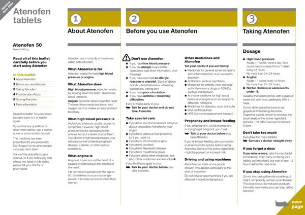
Could a more designed and illustrated appearance lead to people taking the medicine in the prescribed manner? A study suggests this is the case: Layouts that reduce text density, use purposeful sectioning, highlight key messages, and use a logical type of hierarchy helped people to find the right information more quickly.

The example shown in figure 1.5 is a step in the right direction; the different types of information have been given a diversity of treatments to provide emphasis.

Layouts that reduce text density, use purposeful sectioning, highlight key messages, and use a logical type hierarchy helped people to find the right information more quickly.

In a similar vein, the United States Food and Drug Administration (FDA) recently proposed a redesign of nutrition labels on food packaging. Among the changes were putting calorie counts in large type, adjusting portion sizes to reflect how much Americans actually eat, and additional information about sugars in food.

The Lloyd’s Pharmacy research stated that older people make the most mistakes when using medicine information due to either misreading medicine labels or misunderstanding the instructions. Clearer written instructions would solve the comprehension issue; a more ‘large print’ design would enable both older and a wider variety of people to better use the leaflet.

Medicine information leaflets are often printed on thin paper and folded many times to fit into the medicine package. There is a lot of show-through from the information printed on the back of the leaflet, which decreases readability. When the leaflet is unfolded, the paper crease marks affect the readability of the text (see figures 1.3 and 1.4). A possible improvement would be to print the leaflet on a thicker paper. 

Article 63(2) of the European Commission, 2004, states that:

‘The package leaflet must be written and designed to be clear and understandable, enabling the users to act appropriately, when necessary with the help of health professionals.’

Diagnostic testing is examining an existing design to find out how it performs against the agreed performance requirements set at the scoping stage; for example, a satisfactory test outcome is when the information requested within the package leaflet can be found by 90% of test participants, of whom 90% can show that they understand it. Diagnostic testing takes the actions of people using the document as symptoms of the document’s health and is concerned with finding out what is wrong with a design. Diagnostic testing should be used iteratively—that is, repeated until its performance reaches the agreed benchmark. Diagnostic test questions are designed to see whether a consumer can find information quickly and easily and perform actions appropriately.

Conclusion

Earlier research from Lloyds Pharmacy1 and Dickinson et al. demonstrates that design and writing has the potential to make a real difference in regard to medical errors and that design, writing, and production of a medicine information leaflet can have a real positive effect on people’s health.

The design of medicine information leaflets provides some interesting challenges because they might not be seen as a typical creative graphic design job. Just because they do not contain overly designed text or graphics, however, does not mean creativity is not needed, in fact creativity is usually lacking in leaflets typically produced.

Furthermore, creativity when designing medicine information leaflets usually comes in the form of clear writing, clear layout, and user testing—more of an information design challenge rather than graphic design.

The designer’s job is to clearly communicate the desired message. The designer also has to follow guidelines—in this case, not corporate identity guidelines but guidelines laid out in legislation and vetted by a regulatory body.

Effective design can make the difference between a person deciding to read a leaflet or not, or getting the information they need about the medicine they are taking or not. And that difference can be a matter of life or death. The not so typical design challenge of medicine information leaflets shows the importance effective design can have.

Questions / Enquires - hello@RadkaAdvertising.com

tags: design, advertising, ads, creativity
categories: branding, advertising
Tuesday 11.01.22
Posted by Bart Radka
 

The Only UX Reading List Ever

This recommended reading list is for anyone who wants to learn or deepen their knowledge in the disciplines of User Research, Usability, Information Architecture, User-Interface Design, Interaction Design, and Content Strategy experience Strategy.

The list is broad and includes books that exemplify design thinking, processes, methods, principles and best practices. Many of the books on this list are over 20 years old and yet they are still relevant more than ever.

Each book has influenced my perspective, made an impression and helped us to advance our craft. They have shaped the designers we are today and inspired the designer we will be tomorrow.

There’s not a day when we don’t find ourselves thinking and applying the ideas from these books. We hope that you too can extract the same value. 

Our Top Ten

  1. The Design of Everyday Things, Donald Norman

  2. About Face: The Essentials of Interaction Design, Alan Cooper

  3. The Elements of User Experience: User-Centered Design for the Web and Beyond, Jesse James Garrett

  4. Subject To Change: Creating Great Products & Services for an Uncertain World, Peter Merholz, Todd Wilkens, Brandon Schauer, David Verba

  5. A Practical Guide to Information Architecture, Donna Spencer

  6. Communicating Design: Developing Web Site Documentation for Design and Planning, Dan M. Brown

  7. Designing Together: The collaboration and conflict management handbook for creative professionals, Dan M. Brown

  8. Seductive Interaction Design: Creating Playful, Fun, and Effective User Experiences, Stephen Anderson

  9. 100 Things Every Designer Needs to Know About People, Susan Weinschenk

  10. The Shape of Design, Frank Chimero

50 More Must-Reads On Thinking, Methods, Principles and Best Practices

We find it helpful to choose what to read based on what’s relevant at the time. Applying what you’re reading, as you’re thinking and making is a great way to solidify concepts, reflect and learn.

Some old, some new. All important reading, in no particular order.

  • Designing Web Interfaces: Principles and Patterns for Rich Interactions, Bill Scott, Theresa Neil

  • The Laws of Simplicity (Simplicity: Design, Technology, Business, Life), John Maeda

  • Information Architecture for the World Wide Web: Designing for the Web and Beyond, Peter Morville, Louis Rosenfeld, Jorge Arango

  • Sketching User Experiences: Getting the Design Right and the Right Design, Bill Buxton

  • Well Designed: How to Use Empathy to Create Products People Love, Jon Kolko

  • Thoughts on Interaction Design by Jon Kolko

  • Manage Your Day-to-Day: Build Your Routine, Find Your Focus, and Sharpen Your Creative Mind, Jocelyn K. Glei, 99u

  • Linchpin: Are You Indispensable?, Seth Godin

  • Don’t Make Me Think AND Rocket Surgery Made Easy, Steve Krug

  • Designing Interfaces, Jennifer Tidwell

  • Handbook of Usability Testing: How to Plan, Design, and Conduct Effective Tests, Jeffrey Rubin, Dana Chisnell

  • Designing Interactions, Bill Moggridge

  • The Visual Display of Quantitative Information AND Envisioning Information, Edward R. Tufte

  • A Project Guide to UX Design: For user experience designers in the field or in the making, Russ Unger & Carolyn Chandler

  • Gamestorming: A Playbook for Innovators, Rulebreakers, and Changemakers, Dave Gray, Sunni Brown, James Macanufo

  • Mental Models: Aligning Design Strategy with Human Behavior, Indi Young

  • Practical Empathy: For Collaboration and Creativity in Your Work, Indi Young

  • Interviewing Users: How to Uncover Compelling Insights, Steve Portigal

  • The Mobile Frontier: A Guide for Designing Mobile Experiences, Rachel Hinman

  • Design Is the Problem: The Future of Design Must be Sustainable, Nathan Shedroff

  • The User Experience Team of One: A Research and Design Survival Guide, Leah Buley

  • Prototyping: A Practitioner’s Guide, Todd Zaki Warfel

  • Making Meaning: How Successful Businesses Deliver Meaningful Customer Experiences, Steve Diller, Nathan Shedroff, Darrel Rhea

  • Content Strategy for the Web, by Kristina Halvorson, Melissa Rach

  • Responsive Web Design, Ethan Marcotte

  • Just Enough Research, Erika Hall

  • Design Is A Job, Mike Monteiro

  • Designing for Emotion, Aaron Walter

  • Measuring the User Experience: Collecting, Analyzing, and Presenting Usability Metrics, by William Albert, Thomas Tullis

  • Creative Workshop: 80 Challenges to Sharpen Your Design Skills, David Sherwin

  • Letting Go of The Words: Writing Web Content that Works, Janice (Ginny) Redish

  • Designing the Obvious: A Common Sense Approach to Web Application Design, Robert Hoekman Jr

  • Designing the Moment: Web Interface Design Concepts in Action, Robert Hoekman Jr

  • Designing for the Social Web, Joshua Porter

  • Undercover User Experience Design, Cennydd Bowles, James Box

  • Product Design for the Web: Principles of Designing and Releasing Web Products, Randy Hunt

  • Designing the User Interface: Strategies for Effective Human-Computer Interaction, by Ben Shneiderman, Catherine Plaisant, Maxine Cohen, Steven Jacobs

  • This is Service Design Thinking: Basics, Tools, Cases, Marc Stickdorn, Jakob Schneider

  • Resonate: Present Visual Stories That Transform Audiences, Nancy Duarte

  • Metaskills: 5 Talents for the Robotic Age, Marty Neumeier

  • The Brand Gap: How to Bridge the Distance Between Business Strategy and Design, Marty Neumeier

  • Getting Real AND Rework, 37 Signals, Jason Fried, David Heinemeier Hansson

  • Glut: Mastering Information through the Ages, Alex Wright

  • The Humane Interface: New Directions for Designing Interactive Systems, Jef Raskin

  • Designing with Web Standards, Jeffrey Zeldman, Ethan Marcotte

  • Simple and Usable Web, Mobile, and Interaction Design, Giles Colborne

  • Search Patterns: Design for Discovery, Peter Morville, Jeffery Callender

  • Emotional Design: Why We Love (or Hate) Everyday Things, Don Norman

  • Neuro Web Design: What Makes Them Click? Susan Weinschenk

  • Designing for the Digital Age: How to Create Human-Centered Products and Services, Kim Goodwin

  • A Web For Everyone, Sarah Horton, Whitney Quesenbery

Questions / Enquires - hello@RadkaAdvertising.com

tags: design, business
categories: branding
Friday 03.18.22
Posted by Bart Radka
 

Design Without Design

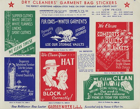
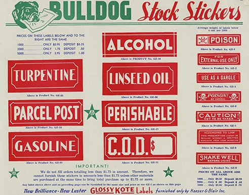
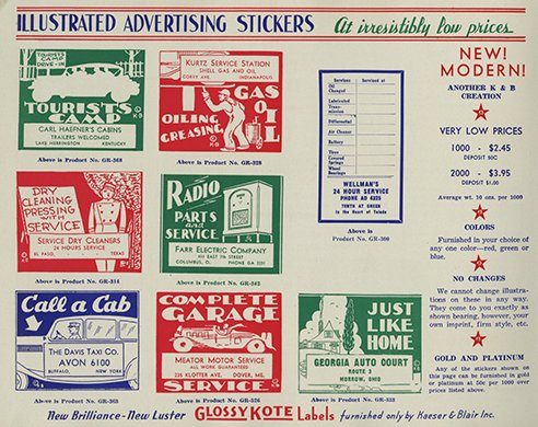
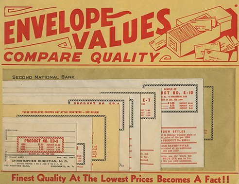
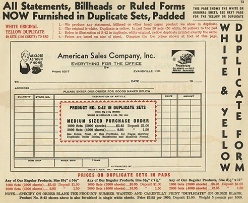
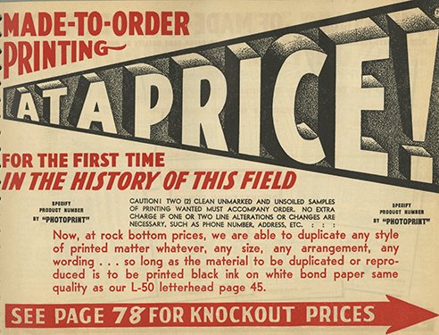
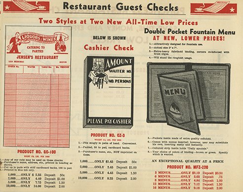
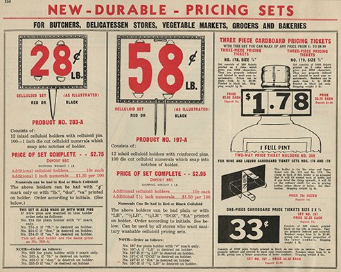
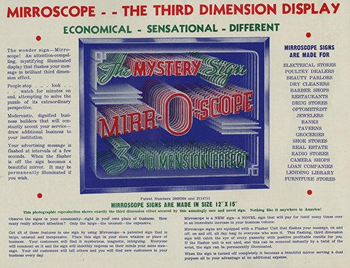
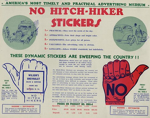
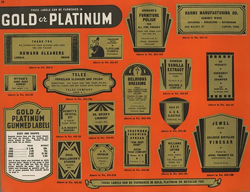
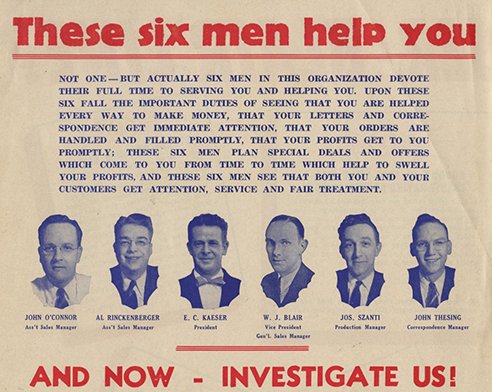
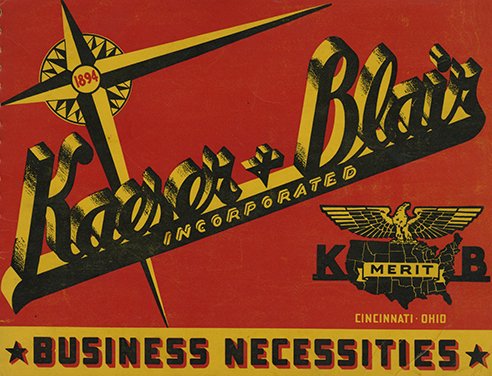
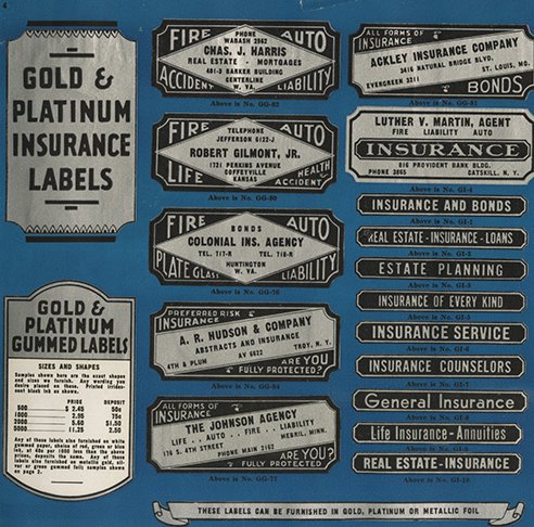
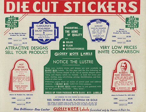
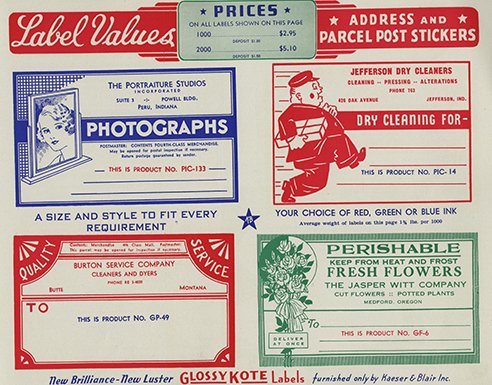
One of the most fascinating aspects about building a design history (especially graphic design history) is finding and tracing an artifact from the past to present. So many large and small companies and firms that practiced in some way or another design, typography and printing no longer exist, while others have surprisingly bridged generations and survived shifts in technology and demographics. When I found the catalog below for Kaeser & Blair, suppliers of all manner of business paper and graphics, I was taken by its demonstrative un-designed design. The material is quaint in a nostalgic sense but historically significant as a marker in that the design is routine, conventional yet visually tied to its context in the 1930s. As an artifact of its time, the catalog (and pages shown here) tells a story.

What makes the story even more interesting is that Kaeser & Blair are still functioning as a programmatic service that helps “companies generate brand awareness through creative advertising and promotional products and services.” Not too far from what you see below, but nonetheless strategically different models.

Kaeser-and-Blair-1.jpeg
Kaeser-and-Blair-3.jpeg
Kaeser-and-Blair-6.jpeg
Kaeser-and-Blair-7.jpeg
Kaeser-and-Blair-8.jpeg
Kaeser-and-Blair-9.jpeg
Kaeser-and-Blair-10 (1).jpeg
Kaeser-and-Blair-12.jpeg
Kaeser-and-Blair-13.jpeg
Kaeser-and-Blair-15 (1).jpeg
Kaeser-and-Blair-26.jpeg
Kaeser-and-Blair-27.jpeg
Kaeser-and-Blair-29.jpeg
Kaeser-and-Blair-36.jpeg
Kaeser-and-Blair-37.jpeg
Kaeser-and-Blair.jpeg

The Company was founded in 1894 as the Cincinnati Printing and Paper Products Co., in Cincinnati, Ohio. In 1923, Dutch Kaeser and Bill Blair purchased Cincinnati Printing and Paper Products Co. and incorporated the Company into what is now known as Kaeser & Blair, Inc.

Kaeser & Blair revolutionized the industry by selling advertising, branding and promotional products that were marketed through independent sales professionals. This new approach produced an exclusive national network of independent sales professionals and Kaeser & Blair experienced significant growth prospering through The Great Depression. The Company eventually expanded its offerings to include more than just paper products; adding items such as imprinted pencils, matchbooks, calendars and more.

In 1951, Bill Blair retired and Dutch Kaeser forged an agreement with his entrepreneurial sons Dick Kaeser and John Kaeser to merge and acquire their successful printing business, Kaeser Incorporated. Together, the Kaesers continued to build their business through solid strategy, purposeful leadership and sound business practices focused on marketing through independent sales professionals.

Dutch Kaeser passed away in 1970 and Dick and John Kaeser each held a term as President of the Company between 1966 and 1983. During this time together, the brothers continued to grow Kaeser and Blair, Inc. and built upon the success and legacy of their father. This continued growth and success eventually lead the Kaesers to pursue advertising and marketing products that were not manufactured in Kaeser & Blair’s manufacturing facilities. These products were called “advertising specialties” and provided Kaeser and Blair’s independent network of sales professionals access to thousands of new products and opportunities from leading brands.

Questions / Enquires - hello@RadkaAdvertising.com

tags: design, advertising
categories: advertising, branding
Wednesday 03.16.22
Posted by Bart Radka
 

8 Design Elements Whose Time Has Come

The old “Embrace, Extend, Extinguish” philosophy hasn’t really helped in the browser war. IE continues to lose browser market share to Chrome and will continue to lose ground if Microsoft cannot keep up with the beautiful innovations present in Chrome, Firefox, and even Safari. In November 2013, Google announced that it would stop supporting IE9, which usually signals that the rest of the UX community will soon follow suit. This is great for the future because your UX can only be as strong as your weakest link. Catering to ancient IE versions always ensures Microsoft’s browser costs you the ability to innovate.

4. Skeuomorphism

A hot topic with design nerds, the skeuomorphism vs. flat design debate raged all of last year and will likely continue into 2014. Arguably, Apple has been the biggest proponent of skeuomorphism through their iOS design choices and their historical majority of users over other mobile systems (prior to 2013). In contrast, Google has championed flat design for years. As Android market share increased dramatically—and with Microsoft jumping aboard the flat train with their new Surface and mobile OS—Apple had to make a choice: Either continue leading a design trend that feels less fresh (and debatably creates a less-friendly UI), or embrace this new trend. With iOS7, Apple went flat, extinguishing the final major skeuomorphism flame.

5. Flash

Although the previous point tabs Apple as a latecomer to the flat design game, they won the Flash battle. When Apple launched the iPhone and iPad with the conscious decision not to support Flash and those platforms took major percentages of web traffic, advertisers, site administrators, and developers embraced this new “HTML5” fad. Now, in 2013 we’ve seen a serious decline in Flash advertising, let alone sites built on that tool. Many of the Flash programmers I know have since embraced Adobe Edge, which is supposedly a grasp at regaining some relevance within the web developer scene, but it seems like too little too late when there are tons of (arguably better) open-source tools available for everything. Originally released in 2011, with major updates in late 2012, Adobe is really pushing Edge, and although Flash is still available and supported, it doesn’t get nearly the developer love it used to. You’d be hard-pressed to find any major sites using Flash components anymore.

6. Web Pages

Web pages are still around, but they’re undergoing some serious innovation lately. Not to harp on a previous point, but the quicker we move away from old IEs that harsh our collective mellow, the sooner we can abandon individual web pages altogether. This trend is a combination of design and technical innovations that appeared a couple of years ago and are now gaining traction. We’ve seen a major shift towards the “application” of websites, which has most likely been employed by platforms that neither need nor want to make native apps to cater to the tablet and mobile users. Sites like Quartz, Facebook and Google Apps exemplify this trend and constantly receive accolades for their approach to UX on the web.

Gawker Media was an early adopter of this approach, with a major shift to a much-maligned and short-lived hashbang-driven experience in 2011. Their site leveraged the pageless design with a new-at-the-time HTML5 standard called PushState which updated content asynchronously without refreshing the navigational elements of the page. Pitchfork.com was another early adopter of this technique and helped popularize a few tools such as PJAX and TurboLinks, the latter of which has become a core feature in Rails 4. We’ve seen more and more sites move this way, and as the barrier to implementation lowers, we will see a greater number of sites take this approach because it makes them leaner, faster, and cheaper to run.

7. Shared Hosting

While I would say “colours” (short for colocation centres) are on their way out, they’ll never completely die since major companies require physical servers (even if we’ll only have Google and Amazon data centres in the future). Regardless, the concept of “shared hosting” is something that makes little to no sense given the massive migration to cloud computing and Platform as a Service (PaaS) offerings. Why spend £20 per month with GoDaddy to host something you have no control over when you could spend a fraction of that to serve precisely the amount of bandwidth you need? Why would you also share your server with someone else you can’t see, creating bottlenecks that you can’t fix? Now, almost every hosting company (GoDaddy, MediaTemple, etc.) has a cloud or virtual server options to compete with big dogs like Heroku, Amazon Web Services, and Google App Engine.

8. “m.” Sites

Until the adoption of responsive design, there was only one good way to deliver content to users who visit sites on a tablet or mobile device: read the initial request, check the user device, and redirect to a mobile version of the same site. The mobile site had to exist as a separate code base with an entirely different set of features. Whenever publishers updated one version of the site, they had to do the same on the other version, complicating maintenance and driving development costs. That said, there are reasons why “m.” sites lasted beyond the advent of responsive design. For example, advertiser platforms took a while to adjust to a single page being able to deliver two entirely different inventories. To handle this issue, advertisers had to serve all ads to every page, and then render only mobile or desktop ads depending on the device. This specific problem has long since been solved by most ad platforms, and now that “responsive design” is basically a household term, the cost benefits of supporting a single platform rather than two presentation layers are clear.

Questions / Enquires - hello@RadkaAdvertising.com

tags: design, advertising
categories: advertising
Thursday 02.17.22
Posted by Bart Radka
 

What is Skeuomorphic Design?

In the early 1900s, electricity was scary.

The lack of understanding surrounding this new technology contributed to a great deal of public fear.

The sign pictured below, from a turn of the century hotel, offers us a glimpse of what it must have been like for guests to make sense of the confusing installations of metal, glass, and wire they found lurking in their rooms.

When it comes to emerging technologies, the stakes for design are high. One misstep and a promising new product can become yesterday’s news. To be effective, designers must set their sights well beyond easy-to-use. We need to convey more than "how". We need to convey "what" as well. We need to be interpreters, to contextualise new products and concisely convey their identity, purpose, and value.

One approach, commonly called design metaphor applies a known concept to a new context to help people make sense of new products. As in literature, repurposing known concepts is a shortcut for accessing shared cultural memory—tapping into the past to make sense of the present.

Skeuomorphs and Affordances

Since the introduction of iOS 7, the blogosphere has been alive with debate on Apple’s departure from skeuomorphism—the yellow lined legal pad of Notes, the leather-bound folio of Calendar. We are now deeply mired in a flat vs. skeuomorphic debate that reduces skeuomorphism to coddling kitsch and equates flat design with high-modernism. Both sides have missed the point.

Skeuomorphs in design aren’t useless decoration, but contextual clues. Like design metaphors, they are the visual equivalent of figurative language—enabling designers to quickly tap into shared cultural understandings and convey complex meanings in a straightforward way. They work as a new kind of affordance, one that communicates not function but identity.

“We shouldn’t abandon cultural affordances like skeuomorphs because some find them tacky or overused.”

Affordances, a concept originated by James Gibson, are an object’s inherent possibilities for action. Donald Norman evolved this definition to encompass the act of communicating possibilities for action through design. These perceived affordances are lingua franca for product designers. Every day we shape things to emphasise their utility, to show how this device operates or to illustrate how to use that application. Until now, this approach has been primarily focused on utility and operation.

A designed affordance: The classic example of a rotating door handle [flickr: sk8geek]

The design of a rotating door handle, for example, suggests how to use it, but does not give us context for what it is or why we should use it. Smartphone or lawnmower, before we figure out how something works, we usually ask what kind of a thing it is and why we should use it in the first place.

Reconsidering Skeuomorphs as Cultural Affordances

Skeuomorphs are stories of utility frozen in time. A new kind of affordance—a cultural affordance—provides the context we need to understand the possibilities for action. They don’t work because they coddle or educate the user—digital wood grain shelves and page-flips didn’t teach people how to read ebooks—they work because they leverage a user’s past experience and apply that understanding to something new.

Take this electric kettle for example. Though thousands of variations exist, we still understand the basic shape as a vessel for heating water. Designers have used a variety of cultural affordances to communicate this purpose. The tapering shape—originally larger on the bottom to maximize contact with the heat source—is no longer a requirement, but remains a key feature. The exaggerated, arching handle amplifies the kettle-ness of the object. Even the electric plug plays a role. Expanded to the scale of a stovetop heating element, it indicates where to put the kettle for use, though this modern version transmits electricity, not heat.

The kettle retains the basic shape of its ancestors and through that shape conveys its purpose. Its form is no longer tied to its literal function, but rather to functional analogues of the past. In the digital realm, where there are fewer precedents for utility, figurative design has long played a critical role in helping people make sense of new products.

The tabbed folders and icons in the Xerox Alto interface

Xerox Alto, the first commercially available graphical user interface (GUI), laid the groundwork for design metaphors like representational icons, tabs, and "spatial" organisation. But there are many more ways to guide users through an interface beyond the ubiquitous tabbed folder metaphor introduced by the Alto. Other metaphor-like conventions like visual synecdoche, where a part can stand for the whole—a letter icon for the inbox—or even playful visual puns, where multiple meanings can be attributed to one object, can also help people make sense of unfamiliar digital territory.

From tabs and folders to the digital "click" on today’s cameras, many cultural affordances have become standard patterns that are used by UI designers without a second thought. But as the hotel sign at the beginning of this article attests, emerging technologies without the necessary cultural affordances leave us wondering. What is it for? How will it be used? It can also leave us even a little afraid of the possibilities.

The Untapped Power of Cultural Affordances

In the last 10 years, over a billion people have started using iPhones. At least a few of those users made the mental leap between the yellow legal pad motif—the one that makes digital designerati stomachs churn—and the idea of a place to quickly jot things down. With the potential to communicate not just functionality, but identity and purpose on that scale, we shouldn’t abandon cultural affordances like skeuomorphs simply because some find them tacky or overused.

Faced with the ever-increasing digitisation of formerly physical products, we should not retreat to the functional, literal design of the past for shortsighted aesthetic reasons. We need to expand the conversation about what design can do through cultural affordances—not simply to address ease of use, but to communicate context, identity, purpose, and value. If we don’t, we may find our users just as wary and confused as the hotel patrons who first encountered Edison’s innovative new electric lights.

tags: design, advertising, ux
categories: branding
Tuesday 01.11.22
Posted by Bart Radka
 

Some Thoughts on Being Flat

Now that we've all had a few months to play with it, I think most of us can agree that iOS 7 offers some very exciting user experience features that set it apart from its predecessors.  

Features like the use of translucent layers to keep navigational context, the added depth of parallax movement effects and transitions, better and more intuitive gestures, reduction of information overload, and the removal of some of the unnecessary visual noise through flattening and thinning the design all have plenty of merits.

It’s not surprising there are many opinions on the updates since this is the first full rethinking of the UI since the first iPhone. With the trend to go simple and flat, some design elements have been purposely avoided. As has been well documented, the new iOS has eliminated some of the common skeuomorphic, or metaphorical design, that has been so strongly associated with Apple.

Forbes contributor Tim Worstall describes skeuomorphism as a “catch-all term for when objects retain ornamental elements from the past, derivative iterations–elements that are no longer necessary to the current objects’ functions.” Some believe this design technique is only meant to be a bridge from getting people to this new mental model and association and is not needed long-term.

I think it makes sense for Apple to move away from skeuomorphic design now that users are familiar with the way things work since this is not the first iPhone. When we think about skeuomorphic design, some of the old metaphors may not be relevant to the new users. For example, many tech users rely primarily on digital calendars and not the standard wall-mounted calendars that used to adorn everyone’s offices and homes. We no longer “tape” on VHS or use records for music consumption or do our note-taking solely on lined paper–our way of life has evolved and so have our metaphors. Even though the skeuomorphic design has disappeared from iOS 7, many users can understand the different features through muscle memory and the jump from analogue to digital in many processes.

““Our way of life has evolved and so have our metaphors””

In his article “Does Skeuomorphic Design Matter?” John Payne discusses how “Skeuomorphs are stories of utility frozen in time. These new cultural affordances work because they leverage a user’s past experience and apply that understanding to something new.” He raises many good points, but I think when it comes to digital, there is a new normal, as many have discussed. We use things in different ways and these skeuomorphic design elements are meant to be the bridge to get users over the hump and adopt a newer mental model.

I do think, however, that the new iOS lacks some perceived affordances. The lack of containers around buttons and spinners and floating airy text is cause for confusion—it causes me to wonder, “is this a button or floating text?” And soon after its release, there were some thoughts on whether this new flat approach is affecting its usability. Some think the pendulum has swung too far to be simple, and many agree a skeuomorphic approach just adds complexity.

Since we have had some time to get familiar with the new design, our mental models have shifted once again. Skeuomorphic design and the analogue metaphors helped us make the jump from our old non-digital world to our new mobile space. But the old way of thinking is gone—we no longer associate mail with an envelope or lined paper with note-taking. Skeuomorphic design helped us get to where we are today: independent of old mental models of a bygone era.

Questions / Enquires - hello@RadkaAdvertising.com

tags: design, advertising
categories: advertising
Wednesday 11.10.21
Posted by Bart Radka
 

Find your place — Brand Positioning

Even the ideally-planned brand is not profitable if it is not well-positioned. The process of brand positioning is probably the most crucial element of the whole business strategy. The potential buyers will not choose your product or service if they don’t associate the brand with any positive values. The right image in their minds is what really sells your offer.

Distinguish yourself

The goal of brand positioning is to make the company and its offer visible among other businesses operating in the same field. The market is fierce, as is the competition. If you want the audience to see and remember you, you need to work on that. That is when the brand positioning steps in. Its main aim is to place your service or product in the mind of the audience, so when a person needs to buy what you offer, they instantly remember the right brand — your brand. 

You can’t force them to bear in mind that your business exists, and they should choose it from the vast possibilities of the market. The audience needs to believe and engage with your idea. The whole brand strategy works on putting this idea in the mind of the audience. If the message is simple, clear, and identifiable it will intertwine with the brand, and in the moment of buying, will spring to the customer’s mind.

Brand positioning requires creativity

The process of brand positioning is not an easy one. It demands thorough research of the market, a creative approach and deep thinking. Before you start expanding and promoting the idea and the brand itself, you need to find the right gap, a niche for your operations. It requires three steps:

  • Understanding of the audience — create an audience persona, an average consumer, and try to follow their way of thinking. Get to know them intimately to determine what they really need.

  • Understanding of the competition — take a closer look at those brands that proved to be successful. Find the feature that distinguishes them. Then don’t repeat that feature.

  • Creative process — when you know what your audience expects and what your competition offers, fill the gap between these two.

Think definitely outside the box and find something that will distinguish you from other brands. Fulfill the needs and desires that are yet to be satisfied. That is your niche and idea that will position the brand.  


Questions / Enquires - hello@radkaadvertising.com

tags: branding, design, marketing
categories: branding, advertising
Saturday 07.03.21
Posted by Bart Radka
 

Key elements of a successful brand

You have an eye-catching logo, a memorable slogan, and the right combination of colors. Does it mean you have a strong, successful brand? Not exactly, as the brand is much more than just these components. Your logo and graphic layout are just a surface of an ocean. What are the core, essential elements that constitute a brand, distinguishes it, and ensures constant trust and interest of the customers?

Make a statement, give a promise

When you’ve already established the vital elements of your business, including its purpose, logo, target audience, and all that, it’s time to make a promise. Make a statement, be heard, believed, and trusted. A successful brand needs to encourage its potential customers by simply explaining what they can gain and how would they benefit. Simple as that. What can you offer them that no one else can? Think it through and express it as straightforward as possible. Making a statement, presenting the brand’s values, and what you and your employees stand for is also noteworthy. Advocate for something, and the right audience will come to you.

How can you help?

Make your customers believe that the promises your brand makes will be kept. Tell them, or even better, instead of telling them, show it. That’s where the brand’s image plays a vital role. The right logo, slogans, website — they all convey a message; is your brand a first-class, premium service or a second-rate at best? Establishing a coherent image and making sure that every element supports the claim you made is a way to differentiate the brand from the dozens of others.

A successful brand keeps its promise

You made a promise, made a customer believe you, so now what? Keep that promise, live up to that statement. The reputation of your brand depends on the customer’s experience at every stage of the purchase. Browsing your website, visiting a store, buying and paying must be pleasant at least, if not memorable. A top-class brand brings the best possible experience. It pays off, as the customers return to you, give their recommendations, and mention your services to others. Word-of-mouth marketing is worth its weight in gold. 

Questions / Enquires - hello@radkaadvertising.com

tags: branding, business, design
categories: branding
Monday 06.21.21
Posted by Bart Radka
 

Websites built to sell

A website is to your online business is as physical shop front is to your offline business. It is one of the most essential parts of your online success. The key is to leave a lasting impression on the visitors who land on your page. If your website doesn't demonstrate professionalism, credibility and attention to the smallest details like high end memorable branding or thoughtful font selection, clients might be scared away. You don’t want to create an impression that your website is one of those sites created hurriedly for scam purposes, do you? Not to mention that 75% of your web visitors will judge your credibility based on web design. Apart from the products or services you offer, a professionally designed website can be one of the differential areas of the business. Remember that the online world is immersed with a huge number of sites. While the majority of these sites are bogus, there are a huge number of others which are marvellous; therefore, you are up against a very stiff competition. If you can get a moderately priced web design that looks professional and which is of high quality, then you would have conquered one obstacle to competing online.

Professional website will make your advertising effort much simpler in light of the fact that you won't be disappointed with high bouncing rates—since Google uses your bouncing rates statistsics against your with regards to search engine ranking. This is because professionally designed site generates confidence and interest. It also assures the potential clients that you are serious with your business, and you are there to stay-who wants to deal with a scam website that can disappear overnight?

Thus, a professional, quality, and credible website forms a basis of your longevity. It also ensures that your brand identity is noted.

Questions / Enquires - hello@radkaadvertising.com

tags: website, business, branding, marketing, design
categories: advertising
Wednesday 04.01.20
Posted by Bart Radka
 

Think Branding

New brands don’t just come from nowhere. They work hard to get the recognition they desire. They’re smart about appealing to their target demographics. Before a product or service launch, they take the time to think deeply about their brand identities: the colors, fonts, and other stylistic choices that make them who they are. In short, they engage in smart brand advertising. Smart brand advertising – Delivers a clear message ‘a brand identity’ – Establishes and confirms brand credibility – Connects with prospects intellectually and emotionally – Motivates prospects to take action – Inspires customer loyalty Brand Identity A brand identity is just what it sounds like: the character and personality of a brand. A brand identity is defined by the brand’s logo, web presence, product or service offerings, copy, and other visual elements that face the public. It is important that the company really thinks this through. Because these elements identify the brand, they should be strong and consistent. The brand identity can say a lot about the company as a whole. The logo, in particular, communicates volumes. The old adage “a picture is worth a thousand words” applies here. Carefully matching the logo to the brand is the first step towards smart brand advertising. Brand Credibility Good brand advertising builds brand credibility. It inspires trust. Customers feel comfortable buying from a brand they trust. It also works to establish a brand as a leader in its industry so it can out - compete other brands. You can accomplish this in many ways, and a combination of approaches will probably be the most effective. Connecting With Prospects Brand advertising is about connecting and reaching out to potential customers to offer solutions they need. These solutions may make intellectual sense but they should make emotional sense too.

Questions / Enquires - hello@radkaadvertising.com

tags: branding, design, creativity, ui, marketing
categories: advertising
Monday 03.30.20
Posted by Bart Radka
 

There are only 2 ways: Be distinctive or Be different

Differentiation is the idea that there is a different perceived meaning behind every brand - the key here being perceived, whether or not the brand meaning is actually different. In other words, if consumers do not perceive a difference, it may as well not be there. Differentiation as the “reason to buy” for the consumer. Academics have touted that brands will only succeed if their consumers perceive them as different from their competitors; however, research has shown that brand perception scores actually tend to be quite similar.

Distinctiveness is a brand’s ability to stand out so that buyers can easily identify it: “I know these sneakers with a swoosh are Nike, and these sneakers with three parallel bars are Adidas”. Distinctiveness is also a brand looking like itself. This characteristic is far more critical for brands than differentiation, as they need customers to quickly notice, recognize, and recall their brand over others. Not only this, but distinctiveness, or branding, is legally defensible. Branding can be trademarked, but points of differentiation cannot.

So how can a brand be distinctive?
Distinctive elements show customers what the brand is. These can include colours, logos, taglines, symbols, celebrities, or even advertising styles. In defining these elements, brands can begin to craft a story around who they are, making sure this story resonates and lingers with their consumers.

These elements are critical, as they play to the neuroscience that helps construct and reinforce memories. As such, the repetitiveness and recognizability of these elements help remove consumer cognitive burden. The more consumers can rely on an implicit reaction to a brand, the more likely they are to buy that brand #innovate

Questions / Enquires - hello@RadkaAdvertising.com

tags: branding, design
categories: advertising
Tuesday 01.14.20
Posted by Bart Radka
 

Music is the strongest form of magic

David Huron, Professor at the School of Music (Ohio State University) describes the functions of music in Advertising - One of the purposes is entertainment. Music makes commercials more appealing by adding aesthetical value to it. Moreover, music supports the structure and continuity of an ad by e.g. emphasizing certain parts. Music also adds memorability to commercials. A popular song, for example, can help to create a lasting impression in the viewer’s mind.

Finally, songs can also provide a message without the viewers consciously noticing it through the lyrics. As mentioned before, different music genres target different kinds of audiences. The right use of music can lead to an increase in sales, but the wrong one can lead to a lot of damage for the company #championscreate

Questions / Enquires - hello@RadkaAdvertising.com

tags: design
categories: music, advertising
Tuesday 01.14.20
Posted by Bart Radka
 

Type - vital component in the world of advertising

Typography refers to the art of arranging type. By using decisive typography you can create interest within your advert, as well as making the advert reading aspect effortlessly. This is a great way to grab readers attention making them more likely to read your advert, and hopefully purchase from your company, or recommend you.

When it comes to branding your business through advertising, typography is an important tool. Choosing the wrong font can give the wrong message, whereas choosing the right font can really drive the message home. 
Choosing the right words to use to get your message can sometimes be hard, words are powerful and depending on the design you use, as well as the type font can result in how the reader comprehends the information. You need to make sure your adverts are readable, the design and visual aspect of art also need to appeal to your brand. Imagine using comic sans on the Ministry of Health advert, for example, it just wouldn’t work. The message wouldn’t be taken seriously.

When you are trying to make your advert a success you need to make sure you are using the correct font, point size, colour, and letter spacing. All these small details can be the difference between your advert being a success or being a failure #innovate

Questions / Enquires - hello@RadkaAdvertising.com
tags: typography, design, creativity
categories: advertising
Sunday 01.05.20
Posted by Bart Radka
 

Let's pop ya colour

When it comes to building a brand identity or a content marketing campaign, it can be difficult to know where to start. You may have an initial idea but bringing it to life and getting your message seen are always harder than initially thought.

Generally, you want your content to resonate with your audience in some way and for them to reach and engage with your marketing. A study published in the Journal of the Academy of Marketing Science suggests that the psychology of colour may also be key to accomplishing this objective. The study demonstrates that consumers’ response to a brand’s identity and its use of colour may also affect their affinity for a brand. This means that marketers who successfully use colour psychology can influence purchasing habits and brand loyalty. While no one colour has been proven to drive sales more successfully than others, the use of colour psychology does appear to impact a brand’s ability to make itself stand out.

Many brands make use of the Isolation Effect, a principle that suggests that a unique colour in a field of uniform hues will stand out more. Brands that apply this psychological principle to brightly coloured call-to-action buttons on their monochromatic landing pages, or to bold packaging that stands out among competitors on store shelves, may have much more success in driving consumers to purchase. Colour is just one of many psychological tools that marketers can use to build successful brands.

Questions / Enquires - hello@RadkaAdvertising.com
tags: branding, design
categories: advertising
Friday 01.03.20
Posted by Bart Radka
 

Ad success: Define. Evaluate. Activate. Repeat

Content distribution plans have never been more important than today. A content distribution plan is a strategic guide that helps an organization disseminate its content, whether it’s promoting the latest blog post or sharing a new ebook. Publishing content can only take you so far; a content distribution plan makes sure that content is seen by the world. Content distribution plans are increasingly important because of the amount of data that individuals and brands are creating each minute.

89% of marketers say awareness is their brands #1 goal therefore there’s a whole lot of content being produced each minute and it’s pretty damn noisy. To cut through the noise and grab their attention, you not only have to produce quality content consistently but also do a killer job distributing it. 
Producing content is one thing - distributing it is another. Without distribution, your content won’t reach your target audience. They won’t know about your product, what it does and how it can help them reach their goals. They’ll have no clue why they should park their marketing dollars with your brand rather than your competitor. You won’t have enough leads to sell your product to.

But content distribution has always been regarded as the Achilles’ heel of content marketing. Not everyone knows how to do it right. For most businesses, content distribution means dumping links on social media, spamming forums, and running ill-planned ad campaigns in hopes of generating leads. They forget that not every content distribution channel is suited for their business, and that even if a channel works, it won’t give them the same results each time. To get consistent sales leads from your blogs, ebooks, email newsletter, podcasts, webinars, and any other content assets, you not only need exceptional content but also a solid content distribution plan. We are talking about the kind of stuff that drives brand awareness, generates leads, and opens the door to conversations with your prospects.

Questions / Enquires - hello@RadkaAdvertising.com
tags: design, marketing
categories: advertising
Wednesday 11.13.19
Posted by Bart Radka
 

Early to bed, early to rise. Work like hell and advertise

Without advertising of any kind, businesses DO fail all the time.

They may resist for a few years, in the state of a “financial zombie” - nor dead, or alive - and then quietly disappear.

Because THIS is true: One can have the best product or service on the face of the planet, but if no one knows about it, it’ll make no difference - they might as well have the WORST product or service.

Why do you think Coca Cola - the company with the highest “awareness level” in the world - spends hundreds of millions of pounds a year on advertising?

To stay relevant and top-of-mind… and to make you reach for a bottle just to “taste the feeling”. We live in a busy world.

We ourselves are busy and keep endless to-do lists.

That makes it easy to forget about a product or service unless we need it right away. (The hospital is not top-of-mind unless we get hurt and need to make a trip to Emergency. And when we do, we go to the closest one available…) By advertising, you “engrave” your product or service in the mind of your prospects and clients, so when they DO need it they reach for yours, instead of the competition.

Questions / Enquires - hello@RadkaAdvertising.com

tags: creativity, design, marketing
categories: advertising
Sunday 11.03.19
Posted by Bart Radka
 

Fit is not a destination. It's a way of life

That's the suggestion of a short but intriguing video on Big Think recently featuring New York University neuroscientist Dr Wendy Suzuki. In it, she explains what her work is uncovering about the benefits of exercising in an unexpected new domain - creativity.

Her research deals with an area of the brain called the hippocampus, which is associated with memory. Injure this area and you'll suffer from amnesia. But according to earlier research, those with damage to their hippocampus also struggle when it comes to imagination. “An experimenter back in 2007 tested amnesic patients on tasks of imagination. And she asked them can you imagine a situation that you've never experienced before. In this case, it was imagining a tropical beach. And she compared the responses to people age matched and education matched people without hippocampal damage,” professor Suzuki explains. “What she found was these hippocampal patients, these amnesic patients who had normal language abilities, we’re unable to imagine a future scenario.” The trouble with the hippocampus, therefore, doesn't just mean you can't recall that beach vacation you took, it also means you can't imagine a future one in any great detail. “There's multiple modes of evidence suggesting the hippocampus is not only involved in memory but is also important for imagination. A key component of creativity,” professor Suzuki summarizes.

How is this fact at all related to exercise? Apparently, the best way for healthy folks to stimulate the hippocampus and generate new brain cells in the area is to get up and get moving. “Because of those brand new brain cells in my hippocampus, I'm also enhancing my imagination. So the hypothesis that I'm working on in my lab is: Can exercise actually enhance creativity?” Suzuki says.

The idea that exercise is a creativity booster is still a hypothesis and more study is needed, but according to Big Think, Suzuki has “a wide array of research” backing up her idea. Gym haters might not love to hear it, but it looks like there could be one more huge benefit of getting a regular fitness workout.

Questions / Enquires - hello@RadkaAdvertising.com
tags: design, health, creativity
categories: advertising
Thursday 09.26.19
Posted by Bart Radka
 

Design is not just aesthetics. It is much more than what we see.

Good design is not just what looks good. It also needs to perform, convert, astonish, and fulfil its purpose. It can be innovative or it might just get the job done.

1. Good design is innovative - it can both be a break-through product or service, and a redesign of an existing product or service. A break-through product adds a before unseen value and function to the market and the user, while a redesign improves an existing product. Innovative design always develops in tandem with innovative technology, and can never be an end in itself.

2. Good design is functional - useful design fills its intended function – and likely both a primary and secondary function. A useful design solves problems and through its design, it optimizes a given functionality.

3. Good design is aesthetic - an aesthetic product has an inherent power of being able to fascinate and immediately appeals to its user’s senses. Only well-executed objects can be beautiful. The aesthetic quality of a product is integral to its usefulness because products used every day have an effect on people and their well-being.

4. A good design is intuitive - it explains itself and makes a user manual unnecessary. A design makes how to use, perceive, and understand a product obvious. A good design explains its function. It clarifies the product’s structure. Better still, it can make the product clearly express its function by making use of the user’s intuition. At best, it is self-explanatory.

5. A good design is a good business - assuming a product is designed to sell, a good design does well in the competition and stands out in a competitive market. Good business means a positive profit, why a good design sells well.

6. A good design is long-lasting - in a society of over-consumption, a good design has an important objective. It builds on sustainability in the sense that design and materials are durable and not just a trend. Waste and over-consumption is not a part of good design. It avoids being fashionable and therefore never appears antiquated. Unlike fashionable design, it lasts many years – even in today’s throwaway society #innovate

Questions / Enquires - hello@RadkaAdvertising.com
tags: design, typography, ui, website
categories: advertising
Wednesday 09.18.19
Posted by Bart Radka
 

Branding Re-Branded

An evening of inspirational chat and a day sat on the other side of our ‘Dig’ process – we take a trip to Bristol for an evening with Michael Johnson of Johnson Banks to do just that.

A talk with the Johnson Banks founder took us through the highs and lows of the branding process in 5 steps, not forgetting step 2.5 – the space in the middle where we sit around trying to translate strategy into creative. We heard about some of the design guru’s best projects, some of which have pushed boundaries, and a few of his own personal targets, including raising £2 billion for Cambridge University. With over £800m already raised, the campaign seems to be working wonders to educate the next generation.

The workshop explored the process of brand and the balance between thinking and doing, something we believe in. A strong, well thought out brand enables you to engage with diverse audiences and ensures your message is clear, meaningful and delivered consistently. Effective branding can change customer perceptions and build long-term relationships. Bad branding, on the other hand, can mean being completely misunderstood, considered unsuitable or overlooked – something reiterated by examples of what some brands have achieved and where some have truly failed.

Working through a branding exercise allowed us to open a dialogue between our team and others in the industry about what works well and what doesn’t, identifying gaps in various markets and ways to build a brand around the gap including narrative, visuals and campaigns to promote it.

It was a great opportunity to turn the tables and approach this as a client – a very interesting experience!

A huge thank you to Michael for his energy and enthusiasm and giving our team the chance to meet fellow creatives at the beautiful studio.

We at Radka Advertising know how important developing and adopting the right branding can be. We also know it’s vital that all imagery should be formed around the true identity and individuality of the client. This is something that we take great pride in; getting to know our clients and understanding who they are, what they do and their unique message. We do this through our Dig process – it’s a key factor in why our branding is so successful.

If you’re looking to brand or re-brand why not get in touch and let us know who you are, what you do and how we can help you get your message across.

Questions / Enquires - hello@RadkaAdvertising.com
tags: branding, design
categories: advertising
Tuesday 05.21.19
Posted by Bart Radka
 

Copyright © 20242Terms & Conditions |GDPR