
In 2008, Lloyds Pharmacy conducted 20-minute interviews with 1,961 UK adults. Almost one in five people admitted to having taken prescription medicines incorrectly; more than eight million adults have either misread medicine labels or misunderstood the instructions, resulting in them taking the wrong dose or taking medication at the wrong time of day. In addition, the overall problem seemed to be more acute among older patients.
Almost one in five people admitted to having taken prescription medicines incorrectly; more than eight million adults have either misread medicine labels or misunderstood the instructions.
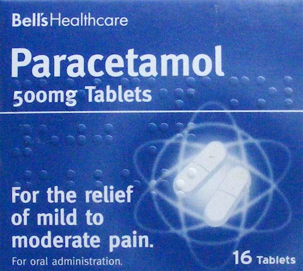
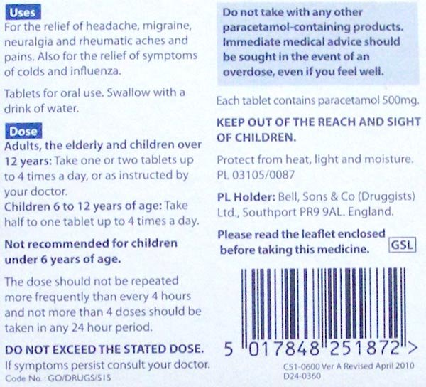
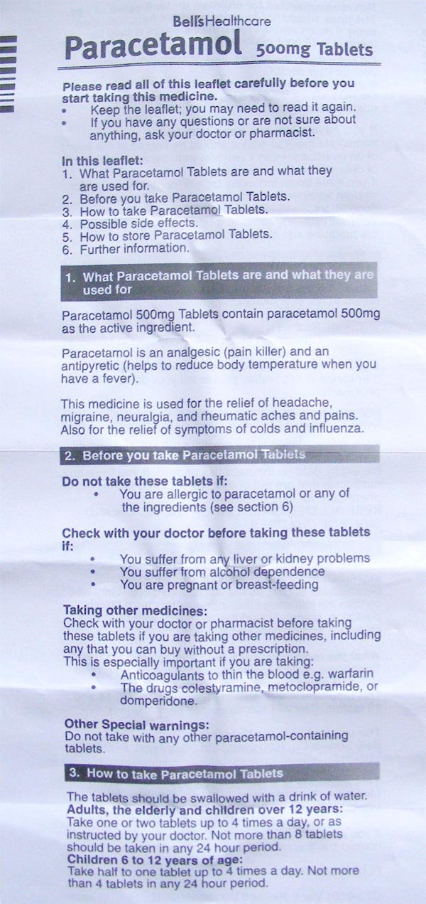
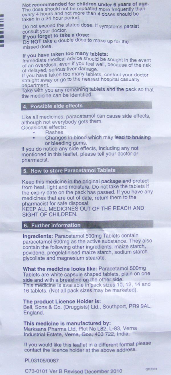
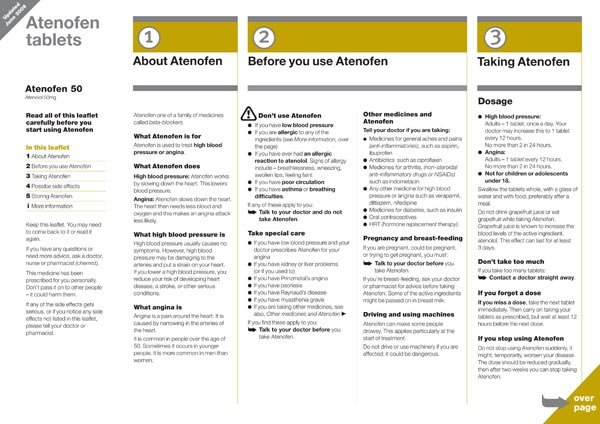
Medicine or patient information leaflets refer to the document included inside medicine packaging and are typically printed on thin paper (see figures 1.1–1.4). They are essential for the safe use of medicines and help answer people’s questions when taking the medicine.
If the leaflet works well, it can lead to people taking the medicine correctly, hopefully improving their health and wellness. If it works poorly, it can lead to adverse side effects, harm, or even death. Subsequently, leaflets are heavily regulated in the way they need to be designed, written, and produced. European and individual national legislation sets out the information to be provided, in a specific order, within a medicine information leaflet.
Adding to the design challenge is the fact that the guidelines for how medicine information leaflets are designed to change from country to country, and the guidelines are often vague.
One of the changes in the 2004 European Commission directive was to ensure that all medical information leaflets ‘reflect the results of consultations with target patient groups.’ In other words, when producing a leaflet, user testing (or ‘readability testing’ as it is also known) must be done. A satisfactory test outcome is when the information requested within the package leaflet can be found by 90% of test participants, of whom 90% can show that they understand it.
The diagnostic testing method for medicine information leaflets also raises a unique challenge when designing leaflets and is more rigorous than the level of user testing most designers are used to.
Additionally, medicine information leaflets are required to be reviewed and approved by a competent authority, which varies from country to country, before being included in the packaging with the medicine.
Possible Design Improvements
How can these materials be designed so that people end up taking the medicine as directed?
One issue with medicine information leaflets seems to be that most people do not read the document from start to finish, although it contains important information. Reasons for not reading or only skimming the leaflet from start to finish could be due to the amount of information or the leaflet design.
Competing sources of information introduce additional confusion. Sometimes the pharmacist will attach to the packaging a sticker with dosage instructions. That sticker can cover the dosage instructions printed on the packaging itself.
There are now potentially three sources of dosage information: the sticker, the packaging, and the leaflet, all with different densities of information. This creates an assumption on the part of the patient that everything they will need to know will be on the sticker–a dangerous assumption because patients do not read through the whole of the medicine information leaflet.
Medicine information leaflets are usually long and contain a wealth of information and complex terminology. An option would be to provide the document written to different educational levels.
Sometimes leaflets do not make the most of headings and sectioning, which keeps people from finding quickly the information they need. Medicine information leaflets are usually minimally treated, featuring only plain text with headings in bold.
Could a more designed and illustrated appearance lead to people taking the medicine in the prescribed manner? A study suggests this is the case: Layouts that reduce text density, use purposeful sectioning, highlight key messages, and use a logical type of hierarchy helped people to find the right information more quickly.
The example shown in figure 1.5 is a step in the right direction; the different types of information have been given a diversity of treatments to provide emphasis.
Layouts that reduce text density, use purposeful sectioning, highlight key messages, and use a logical type hierarchy helped people to find the right information more quickly.
In a similar vein, the United States Food and Drug Administration (FDA) recently proposed a redesign of nutrition labels on food packaging. Among the changes were putting calorie counts in large type, adjusting portion sizes to reflect how much Americans actually eat, and additional information about sugars in food.
The Lloyd’s Pharmacy research stated that older people make the most mistakes when using medicine information due to either misreading medicine labels or misunderstanding the instructions. Clearer written instructions would solve the comprehension issue; a more ‘large print’ design would enable both older and a wider variety of people to better use the leaflet.
Medicine information leaflets are often printed on thin paper and folded many times to fit into the medicine package. There is a lot of show-through from the information printed on the back of the leaflet, which decreases readability. When the leaflet is unfolded, the paper crease marks affect the readability of the text (see figures 1.3 and 1.4). A possible improvement would be to print the leaflet on a thicker paper.
Article 63(2) of the European Commission, 2004, states that:
‘The package leaflet must be written and designed to be clear and understandable, enabling the users to act appropriately, when necessary with the help of health professionals.’
Diagnostic testing is examining an existing design to find out how it performs against the agreed performance requirements set at the scoping stage; for example, a satisfactory test outcome is when the information requested within the package leaflet can be found by 90% of test participants, of whom 90% can show that they understand it. Diagnostic testing takes the actions of people using the document as symptoms of the document’s health and is concerned with finding out what is wrong with a design. Diagnostic testing should be used iteratively—that is, repeated until its performance reaches the agreed benchmark. Diagnostic test questions are designed to see whether a consumer can find information quickly and easily and perform actions appropriately.
Conclusion
Earlier research from Lloyds Pharmacy1 and Dickinson et al. demonstrates that design and writing has the potential to make a real difference in regard to medical errors and that design, writing, and production of a medicine information leaflet can have a real positive effect on people’s health.
The design of medicine information leaflets provides some interesting challenges because they might not be seen as a typical creative graphic design job. Just because they do not contain overly designed text or graphics, however, does not mean creativity is not needed, in fact creativity is usually lacking in leaflets typically produced.
Furthermore, creativity when designing medicine information leaflets usually comes in the form of clear writing, clear layout, and user testing—more of an information design challenge rather than graphic design.
The designer’s job is to clearly communicate the desired message. The designer also has to follow guidelines—in this case, not corporate identity guidelines but guidelines laid out in legislation and vetted by a regulatory body.
Effective design can make the difference between a person deciding to read a leaflet or not, or getting the information they need about the medicine they are taking or not. And that difference can be a matter of life or death. The not so typical design challenge of medicine information leaflets shows the importance effective design can have.
Questions / Enquires - hello@RadkaAdvertising.com