Types of visual branding to boost market recognition

TL;DR:
- Strategic measurement of recognition and distinctiveness is essential for effective visual branding.
- Logos should focus on simplicity, color impact, and unique elements to maximize recall.
- Regular audits and updates every 18 to 24 months help maintain brand relevance and protection.
Choosing the right type of visual branding is one of the most consequential decisions a brand manager will make. Get it right, and you build recognition that compounds over time. Get it wrong, and your marketing spend fights against itself. Consistent branding can increase revenue by up to 23% and brand recognition by 39.7%, yet many teams still make visual branding choices based on personal taste rather than strategic criteria. This article walks you through how to evaluate your options, what each major visual branding type delivers, and how to make decisions that hold up under real market conditions.
Table of Contents
- How to evaluate and select visual branding types
- Logo design: Simplicity, distinctiveness and the power of colour
- Typeface and brand imagery: Consistency across touchpoints
- Motion, kinetic and digital-first visual branding
- Why the strongest visual brands audit and iterate, not freeze
- Take your visual branding to the next level with expert help
- Frequently asked questions
Key Takeaways
| Point | Details |
|---|---|
| Focus on distinctiveness | Visual branding drives success when it is both unique and easily recognised. |
| Maintain consistency | Consistent use of visual elements, including logo, typeface, and imagery, boosts both revenue and brand recognition. |
| Adapt and audit regularly | Regular asset audits and iterations ensure your branding stays current and competitive. |
| Embrace digital and motion | Modern digital-first and motion branding enhance engagement and keep your identity adaptable. |
How to evaluate and select visual branding types
Before you choose a logo style, a colour palette, or a motion identity, you need a framework for measuring what works. Most brand teams default to aesthetics. They ask, “Does this look good?” That is the wrong first question.
Research tracking over a thousand logos confirms you should measure brand asset strength using two core criteria: fame (how readily consumers recognise the asset) and uniqueness (how distinctively it belongs to your brand rather than your category). An asset can look polished and still score poorly on both. This distinction matters enormously when you are investing in brand identity.
Here are the key questions every brand manager should ask before committing to a visual branding direction:
- Does this asset stand out from direct competitors, or does it blend into the category?
- Would a consumer recognise this as ours without seeing our name?
- Does it work across digital, print, and out-of-home formats without losing its character?
- Is it distinctive enough to own legally and culturally?
Practical frameworks help structure this analysis. Asset grids, which map your brand elements against fame and uniqueness scores, let you see at a glance where equity lives and where it is missing. Iteration cycles, which are planned review periods rather than reactive redesigns, keep assets evolving without destabilising recognition.
When evaluating brand assets, one common pitfall is overvaluing appeal. Marketing teams often love assets that consumers find forgettable, simply because those assets feel fresh internally. Consumer-facing recognition tests, even simple ones, expose this gap quickly. You can also explore branding performance data to benchmark how your current assets compare to industry standards.
For context, strong brand building strategies in competitive sectors like beauty and retail consistently show that the brands gaining ground are those treating visual assets as measurable business tools, not decorative choices.
Pro Tip: Set up an asset grid review every 18 months. Score each visual element on recognition and distinctiveness using consumer feedback, not internal opinion. This single habit prevents brand drift and protects equity you have already built.
Logo design: Simplicity, distinctiveness and the power of colour
The logo remains the cornerstone of visual brand identity. It is the first element consumers encounter and the one most directly tied to recall. 75% of people recognise a brand by its logo, and colour alone boosts recognition by 80%. Those numbers explain why logo investment tends to yield the clearest return of any visual branding decision.
But the relationship between logo design and perception is more nuanced than most briefs acknowledge. Research analysing over a thousand logos found that simple logos boost perceived competence, while more complex designs tend to generate warmth and approachability. This is not a reason to choose one over the other. It is a reason to know which perception your brand needs to own before briefing a designer.
“The most effective logos are not necessarily the most beautiful. They are the most ownable.”
Here are the principles that consistently separate high-performing logos from forgettable ones:
- Avoid literal illustrations. A bakery logo shaped like a loaf does nothing to separate you. Abstract or device-led marks build stronger distinctiveness.
- Use colour strategically. Colour is not decoration. It is a recognition trigger. Choose a palette that is uncommon in your category.
- Design for reduction. Your logo must hold up at 16 pixels and at 3 metres. If it needs detail to work, it will not translate.
- Introduce a distinctive character or device. Unique graphic elements, mascots, or proprietary shapes build equity over time in ways wordmarks alone cannot.
Looking at branding recognition benchmarks across industries, the brands with the strongest logo recall tend to own a colour, a shape, or both. Think of the associations built through decades of consistent application. You can also draw lessons from logo design in beauty brands, where the intersection of ethics, aesthetics, and recognition has been studied closely.
The most common mistake at this stage is designing for award submissions rather than consumer memory. A striking concept that judges admire in a portfolio may still fail the recognition test on a shelf or a social feed.
Typeface and brand imagery: Consistency across touchpoints
Your logo earns the first impression. Your typeface and imagery sustain everything that follows. Together, they shape how your brand feels across every touchpoint, from a website header to a trade stand banner.
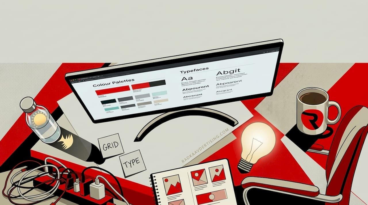
Typeface choices communicate personality before a single word is read. Serif typefaces signal heritage, authority, and tradition. Sans-serif styles read as modern, clean, and accessible. Script fonts suggest personality and craft. Slab serifs communicate confidence and robustness. These are not arbitrary associations; they are learned through decades of category conventions, which is exactly why breaking them deliberately can be powerful for brands seeking to reposition.
Consistent branding across channels increases revenue by up to 23%, and typography is one of the most frequently inconsistent elements across brand teams. Different designers, different markets, and different platforms all introduce drift if there is no governing document.
Imagery works the same way. Photography, illustration, and iconography each carry distinct tonal qualities. A brand using aspirational lifestyle photography on its website but generic stock imagery in email campaigns creates a fractured experience that erodes trust over time.
Here is what a robust visual language system should cover:
- Typography: primary typeface, secondary typeface, use cases for each, sizing ratios, and line spacing rules
- Photography: subject matter, lighting style, colour grading, and what to avoid
- Illustration and iconography: style, weight, palette, and permitted use cases
- Spacing and layout principles: how visual elements relate to each other
Pro Tip: Create a single visual language playbook accessible to every team member and external supplier. Include visual examples of what is permitted and what is not. The “do not do this” column is often more valuable than the rules themselves.
When reviewing branding service options, look for agencies that build governance into the delivery, not just the design. Style guides without enforcement systems are expensive PDFs. You should also consider clarity in brand language as a partner discipline to visual consistency.
Motion, kinetic and digital-first visual branding
Static visual identities were designed for a world where brands lived on packaging and print. That world still exists, but it is no longer the primary arena. Today, your brand identity needs to work in video, on social platforms, in animated UI, and in short-form content formats where static assets can feel lifeless.
Kinetic branding refers to the motion behaviour of your brand’s visual assets: how your logo animates, how transitions feel, how your colour palette moves in video contexts. Motion identity is essential for digital platforms, enabling brands to communicate personality in moments where static visuals would simply scroll past unnoticed.
The benefits are real, but so are the risks. Over-reliance on AI-generated motion assets is creating visual homogeneity across categories, with many brands inadvertently adopting similar styles because they are drawing from the same generative tools. Read more about avoiding AI branding pitfalls before committing to AI-assisted design workflows.
| Feature | Static branding | Motion or kinetic branding |
|---|---|---|
| Best suited for | Print, signage, packaging | Social, video, digital UI |
| Recognition speed | Immediate if well designed | High when motion is branded |
| Production cost | Lower | Higher, requires animation expertise |
| Risk of trend-dependency | Lower | Higher, especially with AI tools |
| Flexibility | Limited to format adaptation | High across digital contexts |
Key considerations when integrating motion into your identity:
- Define motion principles, not just assets. How does your brand move? Fast and sharp or slow and considered?
- Ensure motion assets derive from your existing visual system rather than replacing it.
- Test motion assets at the speed and scale of your actual platforms, not in isolation.
Explore dynamic branding tools to see how motion assets can be managed consistently across campaigns. For a broader view of AI and branding risks in the motion space, the evidence is building that distinctiveness requires human creative direction, not just generative output.
Why the strongest visual brands audit and iterate, not freeze
There is a persistent belief in marketing that the best visual identities are timeless. We would argue that belief is one of the most expensive myths in brand management.
The brands that maintain strong recognition over decades are not the ones that refused to change. They are the ones that changed carefully, on a schedule, guided by data rather than crisis. Research recommends that brands consider an audit and update cycle every 18 to 24 months to stay visually relevant and maintain distinctiveness as markets shift.
The internal team problem compounds this. Marketing professionals who live inside a brand every day develop over-familiarity with its assets. What feels distinctive inside the office can feel invisible to consumers who encounter dozens of competing brands daily. Scheduled consumer-facing recognition audits break this cycle.
From our work across sectors at Radka Advertising, the brands that resist iteration tend to reach a point where change becomes urgent rather than managed, forcing expensive, disruptive redesigns. The brands that iterate incrementally protect equity while staying current. Iteration is not weakness. Freezing is.
Take your visual branding to the next level with expert help
Understanding the types of visual branding is the first step. Applying them with discipline, consistency, and the right measurement systems is where most in-house teams need a strategic partner. At Radka Advertising, a branding agency London teams trust for results, we work with brands across sectors to build, audit, and evolve visual identities that perform in competitive markets. Whether you need a full identity system or a focused asset audit, our visual branding services are built around your business objectives. Speak to our team and find out how we can turn your visual identity into a measurable brand asset.
Frequently asked questions
What is the most important type of visual branding for brand recognition?
A logo is the single most impactful element, with 75% of consumers recognising brands through their logo and colour boosting that recall by 80%. No other visual asset achieves this level of direct recognition on its own.
How often should I update or audit my brand’s visual identity?
Experts recommend an audit every 18-24 months to maintain market relevance and protect distinctiveness as consumer perceptions and competitive landscapes evolve.
What are common pitfalls when choosing visual brand elements?
Overvaluing subjective appeal over measurable distinctiveness is the most frequent error, and AI-generated homogeneity now adds a new risk, with many brands inadvertently adopting similar visual styles.
Why is motion or kinetic branding increasingly important?
Kinetic branding drives engagement and adaptability across digital platforms, enabling brands to communicate identity in video, social, and animated UI environments where static assets lose impact.