How design shapes advertising effectiveness for UK brands

TL;DR:
- Effective advertising relies on visual hierarchy to capture attention within seconds.
- UK regulations are shifting focus from product images to emotional brand assets for better recognition.
- Applying design principles like layout patterns, color rules, and recognition testing enhances campaign success.
Most UK marketing managers assume that packing an advert with product details will drive results. It won’t. Visual hierarchy guides attention in five seconds or less, and if your design doesn’t direct the eye immediately, your message is lost before it’s read. Design is not decoration. It is the mechanism through which your audience decides whether to engage or scroll past. This article explains how design principles directly improve advertising outcomes, why UK regulations are reshaping creative strategy, and what practical steps you can take to build campaigns that perform.
Table of Contents
- Why design matters in advertising
- Principles of visual hierarchy in ad design
- Brand assets versus product ads: Regulatory-driven design in the UK
- Practical steps to implement design-driven advertising
- A new mindset for UK advertising: Why design-first wins
- Take your advertising to the next level with expert design
- Frequently asked questions
Key Takeaways
| Point | Details |
|---|---|
| Design captures attention | Strategic design guides viewer focus within seconds, boosting campaign impact. |
| Hierarchy prevents overload | Applying visual hierarchy and three-element rule avoids confusion and drives clear calls to action. |
| Brand assets outperform product ads | Brand-led creative driven by regulatory shifts deliver stronger emotional connection and effectiveness. |
| Regulations drive design innovation | UK HFSS rules create opportunities for marketers to shift focus from product features to brand assets. |
| Practical steps enhance results | Applying expert principles and compliance checks creates advertising campaigns that deliver and endure. |
Why design matters in advertising
There’s a persistent myth in marketing: that clever copy or a strong offer is enough. In reality, design is doing most of the heavy lifting before a single word is read. The layout, colour palette, and spatial arrangement of an advert communicate brand values, trustworthiness, and relevance within moments. This is not subjective. Graphic design shapes behaviour and consumption rates through its direct impact on brand identity and consumer perception.
Think of design as a strategic tool, not a cosmetic layer applied at the end of a campaign. When a brand uses consistent typography, colour, and visual structure across every touchpoint, it builds recognition. Recognition builds trust. Trust drives conversion. This chain reaction starts with design decisions made long before the media buy.
Visual cues also shape behaviour in ways that rational messaging cannot. A well-placed image of a person making eye contact draws the viewer’s gaze toward the headline. A contrasting call-to-action button signals urgency without a single word. These are not accidents. They are deliberate design choices grounded in how human perception works.
Consider what logo colour signals communicate to your audience before they’ve processed your tagline. Red conveys energy and urgency. Blue projects reliability. These associations are deeply embedded in consumer psychology, and brands that ignore them are leaving perception to chance.
Here’s what strong advertising design consistently delivers:
- Immediate clarity about what the brand stands for
- Directed attention toward the most important message element
- Emotional resonance that rational copy alone cannot achieve
- Consistent identity across digital channels and formats
- Higher recall due to distinctive visual assets
“Design is not just what it looks like and feels like. Design is how it works.” This principle applies directly to advertising: the structure of your creative determines whether your campaign works or wastes budget.
For marketing managers overseeing multi-channel campaigns, understanding visual design and brand perception is the foundation of every effective brief. Get this right, and everything downstream performs better.
Principles of visual hierarchy in ad design
Visual hierarchy is the science of telling your viewer’s eye where to look first, second, and third. Without it, an advert becomes visual noise. With it, even a simple layout can guide a prospect from awareness to action in seconds.
The two most useful reading patterns for digital ads are the F-pattern and the Z-pattern. The F-pattern describes how users scan text-heavy content, reading across the top, then scanning down the left side. The Z-pattern applies to image-led layouts, where the eye travels from top-left to top-right, then diagonally to bottom-left, finishing at the bottom-right. Placing your logo, headline, and call to action along these paths means your key messages get seen even by viewers who don’t read every word.
The golden ratio (approximately 1:1.618) provides a mathematical basis for proportions that feel naturally balanced. Designers use it to position focal points, size imagery, and structure layouts that feel instinctively right to viewers without them knowing why.
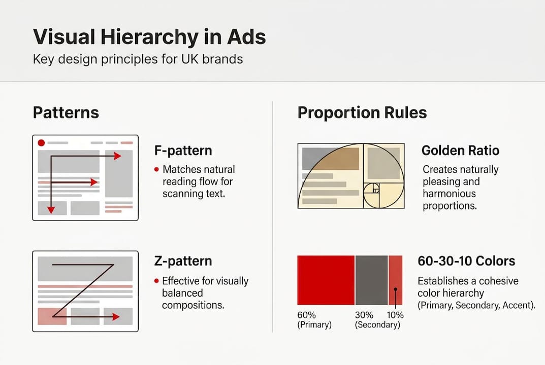
Colour discipline matters just as much. The 60-30-10 colour rule keeps visual complexity under control: 60% dominant colour, 30% secondary, 10% accent. This prevents the visual clutter that confuses viewers and dilutes brand recognition.
The three-element rule is perhaps the most practically useful principle for UK digital campaigns. Working memory holds roughly three to four chunks of information at once. Overload your advert with five messages and viewers retain none. Limit yourself to three core elements and your message lands cleanly.
| Design principle | What it does | Best used for |
|---|---|---|
| F-pattern layout | Guides eye through text-heavy ads | Search ads, display banners |
| Z-pattern layout | Directs attention in image-led formats | Social media, video thumbnails |
| Golden ratio | Creates natural visual balance | Hero images, landing pages |
| 60-30-10 colour rule | Controls colour complexity | Brand campaigns, OOH |
| Three-element rule | Prevents cognitive overload | All digital ad formats |
Here’s how to apply these principles in sequence:
- Define your three core elements before designing: headline, visual, call to action.
- Choose your layout pattern based on the ad format and content type.
- Apply the 60-30-10 rule to your colour palette from the outset.
- Use the golden ratio to position your focal point and size supporting elements.
- Test with five-second exposure to check whether the hierarchy is immediately clear.
Pro Tip: Show your advert to someone unfamiliar with the campaign for exactly five seconds, then ask what they remember. If they can’t recall your headline and brand, your hierarchy needs work.
For teams looking to apply these frameworks consistently, exploring ad design services built around these principles can accelerate results significantly.
Brand assets versus product ads: Regulatory-driven design in the UK
UK advertisers in the food and beverage sector are navigating a significant shift. HFSS (high fat, sugar, and salt) regulations have restricted product-focused advertising across digital channels, pushing brands toward a different creative model entirely. This is not simply a compliance challenge. It is an opportunity.

When you cannot lead with the product, you must lead with the brand. And as it turns out, brand-led design outperforms product-focused advertising in long-term effectiveness. Distinctive brand assets such as McDonald’s golden arches, Coca-Cola’s ribbon motif, or Cadbury’s purple improve mental availability. Mental availability means your brand comes to mind first when a consumer is ready to buy.
Emotional resonance replaces rational product features in this model. Instead of communicating “low in sugar” or “high in protein,” brand-led campaigns communicate belonging, joy, or identity. These emotional associations are stickier. They survive ad fatigue and build cumulative brand equity over time.
| Ad type | Primary driver | Long-term effectiveness | Regulatory risk |
|---|---|---|---|
| Product-focused | Rational features | Lower | Higher under HFSS |
| Brand asset-led | Emotional resonance | Higher | Lower |
The practical implications for UK marketing managers are clear:
- Audit your distinctive assets and identify which ones carry the strongest emotional associations.
- Shift budget allocation toward brand-building creative, not just promotional offers.
- Design for recognition rather than information delivery in restricted categories.
- Build creative systems around assets that work across formats without featuring restricted products.
“Brands that invest in distinctive assets today are building the mental shortcuts that drive purchase tomorrow, regardless of what regulations restrict.”
This is where brand-based creative approaches become a genuine competitive advantage. Brands that have already built strong visual identities are far better positioned to absorb regulatory constraints without losing market share. Those still relying on product visuals face a harder transition.
The HFSS regulation impact is accelerating a shift that was already underway. Smart advertisers are treating it as a catalyst, not a constraint.
Practical steps to implement design-driven advertising
Knowing the principles is one thing. Building a design-driven campaign from scratch is another. Here is a structured approach that UK marketing managers can apply immediately.
-
Audit your current brand assets. Identify your most recognisable visual elements: logo, colour palette, typography, mascots, or sonic branding. Rank them by recognition and emotional association. These are your campaign anchors.
-
Define your hierarchy before briefing creative teams. Decide which single message must land first. Every other element is secondary. Brief designers with a clear hierarchy, not a list of things to include.
-
Apply colour rules deliberately. Use your dominant brand colour for 60% of the layout, a complementary secondary for 30%, and a high-contrast accent for calls to action. Consistency across formats builds recognition faster than variety.
-
Design for the format, not the message. A social media story demands a Z-pattern layout. A display banner may suit an F-pattern. Adapt the hierarchy to how the format is consumed, not the other way around.
-
Stress-test for HFSS compliance early. If your category is affected, remove product imagery from initial concepts and assess whether the brand still communicates clearly. If it doesn’t, your asset base needs strengthening.
-
Measure recognition, not just clicks. Brand asset-led campaigns build mental availability over time. Track brand recall and association metrics alongside direct response data to capture the full picture.
Pro Tip: Brief your creative team with a “five-second test” requirement built into the process. Every ad concept must pass the test before it progresses to production. This single step eliminates the most common hierarchy failures before they cost you budget.
For teams that need structured support, design implementation resources can provide frameworks and templates that embed these principles into your workflow.
A new mindset for UK advertising: Why design-first wins
Most UK brands still brief campaigns around the product. The product is the hero, the features are the message, and design is the wrapper. This approach is increasingly ineffective, and the evidence is unambiguous.
Colour signals brand traits such as excitement, trust, and luxury, and visual hierarchy predicts campaign effectiveness through biometric measurement. These are not soft creative opinions. They are empirical findings that should be informing your briefs today.
The uncomfortable reality is that emotional branding is no longer optional for UK advertisers. HFSS regulations have made it regulatory-driven. But even outside restricted categories, the brands winning market share are those that have built brand effectiveness through design rather than through product promotion alone.
We have seen this pattern repeatedly across campaigns in food, retail, and consumer goods. The brands that invest in distinctive visual assets and emotional resonance outperform those chasing short-term promotional metrics. Design-first is not a creative preference. It is a strategic imperative.
Take your advertising to the next level with expert design
If this article has clarified anything, it’s that design decisions are business decisions. Every layout choice, colour selection, and hierarchy structure either builds or erodes your brand’s effectiveness in the market. At Radka Advertising, we help UK brands translate these principles into campaigns that perform. Our advertising and marketing services are built around strategic design, regulatory awareness, and measurable brand outcomes. Whether you’re navigating HFSS compliance, refreshing your brand assets, or scaling across digital channels, our AI growth solutions and client portal give you the tools and expertise to move forward with confidence.
Frequently asked questions
How does design influence advertising effectiveness in digital campaigns?
Design guides viewer attention through visual hierarchy principles such as F-pattern and Z-pattern, shaping brand perception within seconds and boosting campaign results through distinctive visual assets.
What are the main design principles UK marketers should use?
UK marketers should prioritise F-pattern and Z-pattern layouts, the golden ratio, the 60-30-10 colour rule, and asset-driven branding to maximise impact and maintain regulatory compliance.
How do HFSS regulations affect advertising design in the UK?
HFSS rules restrict product ads in digital channels, requiring brands to shift toward emotional resonance and brand asset-led creative, which research shows delivers stronger long-term effectiveness.
What are common mistakes marketers make in ad design?
The most frequent error is overloading adverts with too many messages, ignoring the three-element rule and failing to establish a clear visual hierarchy that guides the viewer’s eye.
Which colours should brands use to signal traits?
Red signals excitement, blue conveys trust, and purple communicates luxury; selecting colours that align with your desired brand traits strengthens perception before a word is read.
Recommended
- ClientPortal | RADKA ADVERTISING
- Full-Service Advertising Agency — London | Radka Advertising
- Case Studies — Our Work | Radka Advertising
- Services — Full-Service Advertising & Marketing | Radka Advertising
- Role of creative in ads: Boost marketing performance
- Create winning ad creatives: a step-by-step SMB guide