Web Accessibility Checklist: Practical WCAG 2.2 AA for UK Devs & QA

Use a WCAG 2.2 Level AA checklist run through layered testing (automated scans, manual review, and assistive-technology checks) to catch the barriers that actually stop people using a site. Start with a representative sample of pages, run a quick automated scan, then do a five-minute keyboard smoke test before anything else. That combination surfaces most common failures fast, though no checklist alone guarantees full compliance.
TL;DR:
- Running automated scans before any design or content changes can identify half or more of common accessibility issues, especially for keyboard and contrast failures.
- A basic keyboard test, contrast check at 400% zoom, and alt text review will catch the majority of barriers for keyboard users, screen reader users, and mobile viewers.
- Testing component-level features like forms, images, tables, and media with proper labels, descriptions, and captions is essential for full WCAG compliance.
- Incorporating accessibility checks into the development process, including automated CI scans and pre-publish checklists, prevents recurring issues and streamlines remediation.
- Contractual requirements with third-party vendors and continuous testing of user journeys ensure accessibility remains resilient through updates and new content.
Table of Contents
- Web accessibility checklist: what to run right now
- Checks organised by WCAG’s four principles
- Component-level accessibility testing: images, forms, tables, and more
- How to build a testing process that finds real problems
- Turning findings into fixes: logging, triage, and accessibility statements
- Building accessibility into a marketing website roadmap
- Avoiding seizure triggers in timing and animations
- Handling dynamic content updates and live regions
- Why checklists fail without process change
- How Radkaadvertising helps you get accessible sites live faster
- Sources
- FAQ
Web accessibility checklist: what to run right now
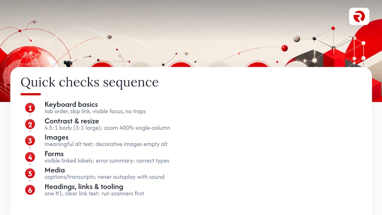
You don’t need a six-week audit to find your worst problems. A focused pass across a handful of checks will expose most of what breaks for keyboard users, screen reader users, and anyone zooming in on a phone. Here’s the sequence we run first on any new site, in the order that catches the biggest issues fastest.
Keyboard basics. Tab through the page from the top. Does focus move in a sensible order? Is there a skip link to jump past the navigation? Can you see where focus is at all times, and does it ever get stuck (a “focus trap”)? These four checks alone reveal a huge share of real-world barriers, because keyboard-only users and switch-device users depend entirely on this working.
Contrast and text resizing. Body text needs a contrast ratio of at least 4.5:1 against its background (3:1 for large text), and your focus indicator needs at least 3:1 against its surroundings according to the DWP’s keyboard testing guidance. Then zoom the browser to 400%, equivalent to a 320 CSS pixel viewport, and confirm the layout reflows into a single column without horizontal scrolling and without losing content, a check GOV.UK’s accessibility statement guidance treats as standard practice.
Images. Every meaningful image needs alt text that describes its purpose, not just its content. Purely decorative images (a background flourish, a spacer) need an empty alt="", never a missing attribute.
Forms. Every input needs a visible, programmatically linked label. Error messages should appear both inline and in a summary at the top of the form, and input types (email, tel, date) should match what’s actually being collected.
Media. Video needs captions; audio-only content needs a transcript. Never let anything autoplay with sound, and if it must autoplay, give the user an immediate, obvious way to pause it.
Headings and links. One H1 per page, no skipped heading levels (an H2 followed directly by an H4), and link text that makes sense out of context. “Click here” tells a screen reader user nothing; “download the 2026 pricing guide” does.
For tooling, Accessibility Insights and browser-based scanners like axe and Lighthouse give you a fast first pass. Treat their output as a list of leads to investigate, not a certificate of compliance.
Pro Tip: Run your automated scan before you touch a single line of copy or design. Half the “quick fixes” teams celebrate are things a scanner would have caught in thirty seconds, for free, at the start of the project rather than the end.
A rough short pass across keyboard, contrast, and image checks on your busiest pages will catch the majority of what a full audit later flags as urgent. It won’t catch everything. Complex forms, dynamic content, and third-party widgets need the deeper checks covered below.
Checks organised by WCAG’s four principles
WCAG 2.2 organises every success criterion under four principles: perceivable, operable, understandable, and robust. Working through a checklist in that order stops you fixing colour contrast on Tuesday and forgetting keyboard traps entirely.
Perceivable: can people actually consume the content?
Content is perceivable when it doesn’t depend on a single sense or a single way of rendering it.
- Every meaningful image has alt text that conveys purpose; decorative images use
alt="". - Complex images (charts, infographics, diagrams) have their data explained in surrounding text, not locked inside a picture.
- Every video has captions; every audio-only file has a transcript; pre-recorded video with important visual information gets an audio description.
- Text contrast meets 4.5:1 for normal text and 3:1 for large text (18pt or 14pt bold and above).
- Colour is never the only way information is conveyed. A red border on an invalid field needs an icon or text label alongside it, for readers who cannot distinguish red from the surrounding grey.
- Content reflows cleanly at 400% zoom without horizontal scrolling.
Alt text is where most sites quietly fail, because automated tools only check whether the alt attribute exists, not whether it’s any good. A scanner will happily pass an image tagged alt="image1.jpg". Only a human reviewing the page in context can tell you whether that image needed a real description, needed to be marked decorative, or needed its data spelled out in the paragraph next to it.
Operable: can people move through and use it without a mouse?
- Tab and Shift+Tab move focus forward and backward in a logical, visual order.
- Enter and Space activate buttons and controls; Escape closes dialogues and menus.
- A visible focus indicator appears on every interactive element, with at least 3:1 contrast against its background, as the DWP’s testing manual specifies.
- No component traps focus, meaning you can always tab away from it.
- A skip link lets keyboard users jump straight past repeated navigation to the main content.
- Interactive touch targets are large enough and spaced enough to hit reliably on a phone screen.
Keyboard traps are the single most disqualifying bug you’ll find, and they hide in the components teams test least: date pickers, cookie banners, chat widgets, and custom dropdowns built without native <select> elements.
Understandable: does it make sense once you can perceive and operate it?
- Headings and labels describe what follows accurately, not cleverly.
- Navigation stays in the same place and works the same way across every page.
- Language stays plain: short sentences, defined jargon, no unnecessary acronyms.
- Error messages say what went wrong and how to fix it, not just “invalid input.”
- Confirmation flows (before a payment, before a delete) give the user a clear chance to review and change their answer.
Robust: does it keep working across browsers, devices, and assistive technology?
- Semantic HTML comes first: use
<button>,<nav>,<table>, and<label>before reaching for a<div>with a role bolted on. - ARIA attributes fill genuine gaps, never replace native elements that already do the job.
- The page declares its language (
lang="en-GB") and any embedded foreign-language content marks its own language too. - Landmarks (
<header>,<main>,<nav>,<footer>) give assistive technology a map of the page structure. - Every interactive element has an accessible name a screen reader can announce, not just a visual label.
Component-level accessibility testing: images, forms, tables, and more
General principles are easy to agree with. The failures happen in specific components, and this is where a checklist earns its keep.
-
Images and SVGs. Decide, component by component, whether an image is decorative or informative. Decorative images get
alt=""; informative ones get a description of what they communicate, not a literal caption of what they show. An icon-only button (a magnifying glass for search) needs an accessible name viaaria-label, since there’s no visible text for a screen reader to read. -
Forms. Every field needs a visible label, properly associated with
for/idor wrapped in a<label>. Hints and instructions link viaaria-describedbyso screen readers announce them alongside the field. Invalid fields carryaria-invalid="true", and the page presents an error summary near the top, listing every problem with a link to the relevant field. -
Tables. Data tables need a
<caption>describing what the table shows, a proper<thead>/<tbody>split, andscope="col"orscope="row"on header cells so assistive technology can announce which header applies to which cell. Never use a table purely for visual layout; that confuses screen readers into announcing row and column positions for content that has none. -
Navigation and headings. One
<h1>per page, headings nested without skipping levels, and landmark regions that give skip links something real to jump to. A page with three<h1>tags and no<h2>at all is common, and it wrecks the outline screen reader users rely on to scan a page quickly. -
Modals and pop-ups. These are where keyboard testing most often breaks down. Modal failures are one of the most common causes of keyboard traps: test opening the modal, tabbing through its contents, submitting or cancelling, and confirming focus returns to a sensible place afterwards, usually the element that opened it. Escape should always close it.
-
Media players. Captions and transcripts are non-negotiable for anything with speech. Player controls (play, pause, volume, seek) all need to be reachable and operable by keyboard, with accessible names a screen reader can announce.
How to build a testing process that finds real problems
A checklist only works if you run it against the right pages, in the right order, with more than one method.
Build a representative sample first. Don’t test only the homepage. A defensible sample covers the homepage, a text-heavy content page, an image or video-heavy page, a form or transaction flow, the login page, any PDFs in circulation, dynamic or pop-up content, and navigation or search results pages, following the sampling approach Gov. Skip the sample and you’ll certify a site as accessible having never looked at the one form that actually takes payment.
Layer your methods. Run automated scans first, since they’re fast and catch obvious, repeatable errors across every page at once. Follow with a manual semantic review of the HTML structure, then a full keyboard-only pass, then spot checks with a screen reader (NVDA or VoiceOver cover most cases). Real-user testing with disabled participants, where you can arrange it, catches what none of the above will.
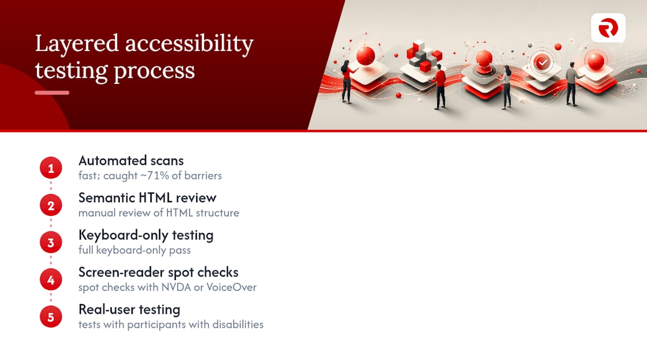
Automated tools genuinely matter here, but they have a hard ceiling. In a UK government audit that deliberately built barriers into a test page, automated tools caught roughly 71% of them, leaving nearly three in ten for manual and assistive-technology testing to find. Treat a clean automated report as a starting point, never a finish line.
Tools like axe, Lighthouse, and Accessibility Insights are best understood as spellcheckers for accessibility: brilliant at flagging the obvious and consistent, useless at judging whether your alt text actually makes sense or your error message is genuinely helpful. Component checks alone can miss interaction problems too, like a focus indicator that gets visually obscured by a sticky header; testing whole user journeys rather than isolated components catches those.
Retain your evidence. For every issue found, keep a screenshot, the browser and assistive-technology version used, the exact reproduction steps, and confirmation of the retest once it’s fixed. That record is what turns a one-off audit into something you can actually act on and defend later.
Turning findings into fixes: logging, triage, and accessibility statements
An audit that produces a document nobody opens again has wasted everyone’s time. Treat every finding the way you’d treat a functional bug.
Log each issue with these fields:
- The affected URL or component
- The WCAG success criterion it breaches
- The real user impact (not “fails WCAG 1.4.3” but “low-vision users can’t read the pricing table”)
- Reproduction steps
- Evidence (screenshot, video, or assistive-technology output)
- Severity and an owner
- A due date
That structure follows the approach government accessibility teams use to track systemic issues rather than firefighting individual bugs in isolation.
Prioritise by impact, not by ease. Fix core journeys, checkout, sign up, contact forms, before cosmetic issues on a rarely visited landing page. A high-impact AA failure on your login screen outranks a low-impact polish item on a blog post every time.
Build regression checks into your release process. Automated accessibility scans belong in continuous integration, running on every pull request. Manual keyboard and screen reader spot checks on core journeys belong in your pre-release checklist, not left to whoever remembers before launch.
Publish an accessibility statement if you’re covered by public sector rules. These describe the site’s compliance status, list known inaccessible parts and their alternatives, and give a route for users to report problems, following the format GOV.UK sets out for public sector accessibility requirements. Revisit the statement whenever you complete a remediation pass, not once a year on autopilot.
Pro Tip: Document third-party widgets separately from your own code. A booking widget or chat plugin you don’t control still fails your users on your site, so log the supplier, the specific defect, any workaround, and who’s chasing the fix.
Building accessibility into a marketing website roadmap
A checklist run once during a redesign fixes today’s problems and lets tomorrow’s content quietly reintroduce them. The fix is embedding accessibility checks into your definition of done, so a page can’t ship without passing them, the same way it can’t ship with broken links.
A realistic audit-and-remediation sprint for a marketing website runs in three stages: a one to two week audit against the representative sample described earlier, a two to three week remediation sprint prioritising core journeys and high-impact AA failures, then a retest pass confirming fixes hold and nothing regressed.
Handoff matters as much as the fix itself. Content editors need a short, plain checklist covering alt text, heading structure, and link text before anything publishes. Third-party suppliers, whether they’re building a booking widget or a payment form, need accessibility written into the contract as an acceptance criterion, not raised as a surprise after launch.
- Add accessibility criteria to design handoff and engineering acceptance criteria
- Run automated scans in CI on every build
- Give content editors a one-page pre-publish checklist
- Require third-party suppliers to confirm WCAG 2.2 AA support contractually
Avoiding seizure triggers in timing and animations
Flashing content is one of the few accessibility failures that can cause genuine physical harm, which is why WCAG treats it separately from other visual issues. Anything that flashes more than three times per second risks triggering seizures in people with photosensitive epilepsy, and the safest approach is avoiding rapid flashing entirely rather than trying to stay just under the threshold.
Autoplaying animations and video carry a quieter but still real cost: they distract users with attention or vestibular disorders and can trigger discomfort in people with motion sensitivity. Give users control. Any animation lasting more than five seconds needs a pause, stop, or hide mechanism, and content that moves, blinks, or scrolls automatically should never start without a way to turn it off.
Time limits deserve the same scrutiny. A session that logs users out after a fixed period, or a form that discards input after a countdown, disadvantages people who read more slowly or navigate with assistive technology. Where a time limit is necessary, give users the option to extend it, turn it off, or receive a clear warning before it expires.
Parallax scrolling effects and auto-advancing carousels are the two most common offenders on marketing websites specifically. Both look impressive in a design review and both routinely fail this part of WCAG when nobody checks them against a stopwatch.
Handling dynamic content updates and live regions
Content that changes without a page reload, a form validation message, a live search result count, a chat notification, needs a way to tell assistive technology something has changed. Without that, a screen reader user has no idea a cart total updated or an error appeared, because nothing on screen announced it to them.
ARIA live regions solve this. Marking a container with aria-live="polite" tells screen readers to announce changes inside it once the user is idle, appropriate for non-urgent updates like a “saved” confirmation. aria-live="assertive" interrupts immediately, reserved for genuinely urgent messages like a form submission failure. Overusing assertive regions is a common mistake: constant interruptions become as unusable as no announcement at all.
Test dynamic updates the same way you’d test anything else: trigger the change with a screen reader running and confirm it announces something meaningful, not just “region updated.” A search results count that announces “12 results found” is useful; one that silently updates a number on screen is invisible to anyone not looking directly at that pixel.
Loading states need the same treatment. A spinner with no accessible name leaves screen reader users guessing whether the page is broken or simply working, and status messages should clear themselves once the action completes rather than lingering as stale information.
Why checklists fail without process change
Most accessibility defects are not one-off mistakes. They’re the same handful of failures, missing alt text, unlabelled form fields, broken focus order, showing up release after release, on team after team. That pattern tells you the problem isn’t a lack of knowledge. It’s a delivery pipeline that never asked the question before the code shipped.
Fixing that means treating accessibility as an acceptance criterion, not a QA afterthought. Automated checks belong in CI, catching regressions before a reviewer ever sees them. Manual keyboard and screen reader passes belong in the pre-release checklist for core journeys, not left to whoever remembers. And supplier contracts, for the plugin, the booking widget, the payment form you didn’t build in house, need WCAG 2.2 AA support written in before signature, not negotiated after a user complains.
Checklists catch defects. Process stops them recurring.
— Bart
How Radkaadvertising helps you get accessible sites live faster
Running your own audit is worth doing, but a marketing site with tight deadlines rarely has spare engineering time to build the sample, run the layered tests, log every issue, and retest before launch. Radkaadvertising’s UX Research & Strategy and Website Design & Development teams build accessibility checks into the design and build process from the first wireframe, rather than bolting them on after the site is already live.
If you want a second set of eyes on your current site before your next release, get in touch through the Radkaadvertising services page to scope an audit.
Sources
For the standard itself, go to the W3C’s WCAG 2.2 guidance and the DWP accessibility manual’s keyboard testing pages, both written for practitioners rather than lawyers. GOV.UK’s basic accessibility check guidance and public sector accessibility requirements cover sampling and statements in plain language. For tooling context, the Accessibility Insights guide explains what automated scanning can and can’t do.
FAQ
What is an accessibility checklist?
An accessibility checklist is a structured set of checks, covering keyboard navigation, colour contrast, image alt text, forms, and media, used to test whether a website meets recognised standards like WCAG 2.2. It’s a working tool for audits and development, not a legal certificate, since full compliance also depends on manual and assistive-technology testing.
What are the four principles of WCAG?
WCAG organises its success criteria under four principles: perceivable, operable, understandable, and robust, sometimes remembered by the acronym POUR. Each principle covers a different failure mode, from content you can’t perceive at all to markup that breaks in assistive technology.
What’s new in WCAG 2.2?
WCAG 2.2 added nine new success criteria, several at the A and AA levels that most professional checklists now target, according to the DWP’s accessibility manual. The additions focus heavily on focus visibility, target size, and reducing reliance on dragging gestures.
What are the best accessibility testing tools?
There’s no single definitive top ten, but the tools that come up repeatedly in professional audits include axe, Lighthouse, and Accessibility Insights for automated scanning, alongside screen readers like NVDA and VoiceOver for manual checks. Automated tools alone catch a meaningful share of issues but miss the rest, which is why layered testing combining automated and manual methods is the standard professional approach.
How much does an accessibility audit from Radkaadvertising cost?
Current pricing for Radkaadvertising’s audit and remediation work sits within its wider service offering, and exact costs depend on the scope of your site. Full details are available on the Radkaadvertising services page.