Marketing dashboard metrics: a practical playbook for UK teams

Every executive marketing dashboard needs seven headline KPIs: marketing-attributed revenue (or pipeline contribution), ROAS/ROMI, customer acquisition cost (CAC), LTV:CAC ratio, conversion rate, organic sessions or reach, and a single engagement metric relevant to your primary channel. Organise them across three tiers and you have a dashboard that drives decisions rather than decorates a screen.
- Strategic tier (CMO/board): 5–7 KPIs, reviewed weekly or monthly, focused on commercial outcomes.
- Channel tier (paid, SEO, email, social leads): 8–12 KPIs per channel, reviewed daily or weekly, focused on channel health.
- Operational tier (campaign managers): 8–12 KPIs per active campaign, reviewed hourly or daily, focused on in-flight optimisation.
Before you add any metric, run three quick questions: Does it answer a specific business question? Does it have an owner, a cadence, and a threshold? If any answer is no, the metric does not belong on the dashboard.
Pro Tip: Research from Chillmetrics suggests the most reliable test for a metric’s usefulness is whether a 20% drop in it leads to a clear, documented action. If your team shrugs, remove it.
Key takeaways
The most important principle in marketing dashboard design is this: every metric must answer a specific business question, have a documented owner and threshold, and change what your team does when it moves.
| Point | Details |
|---|---|
| Use the three-tier structure | Split dashboards into strategic (5–7 KPIs), channel (8–12), and operational (8–12) tiers, never mixing them on one screen. |
| Apply the three-question audit | For every metric, confirm it answers a business question, has an owner and threshold, and triggers a clear action on a 20% change. |
| Effective dashboards cut reporting time by ~80% | Well-structured dashboards reduce manual reporting effort substantially and accelerate decision-making across the team. |
| Fix data quality before design | Confirm API access, map unique identifiers, automate refreshes, and add last-updated timestamps to every tile before building. |
| Radkaadvertising offers a fixed-scope audit | The agency’s managed analytics service maps your metrics to the three-tier framework and delivers a prioritised dashboard build plan within two weeks. |
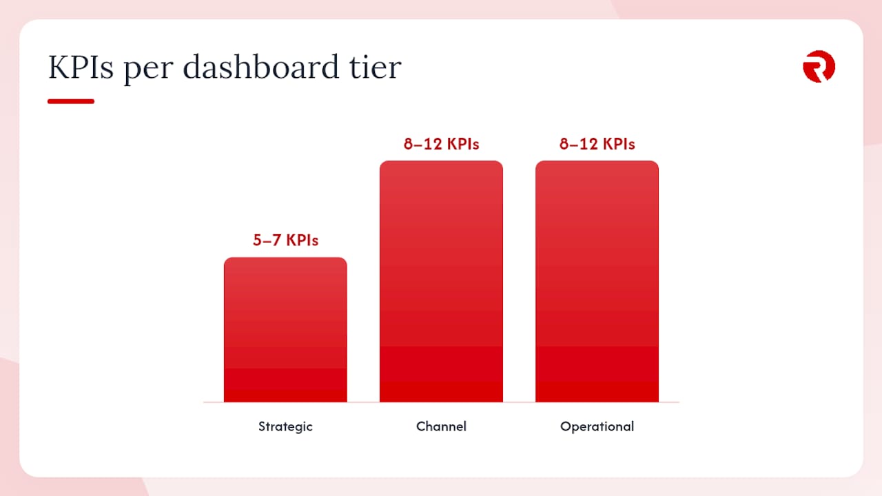
Table of Contents
- What are marketing dashboards and why do UK teams need them?
- Which marketing dashboard metrics should you actually track?
- Role-specific dashboard templates you can copy
- How do you gather and clean data for a marketing dashboard?
- What makes a marketing dashboard actually usable?
- Which tools help you build and manage marketing dashboards?
- Agency case study: mapping KPIs to business goals for a UK client
- How do you choose the right metrics for your organisation?
- How do you integrate offline and multichannel data into marketing dashboards?
- Common mistakes that make marketing dashboards useless
- Why most dashboards fail before they are even built
- Radkaadvertising delivers managed analytics that drive real decisions
- Sources
- FAQ
What are marketing dashboards and why do UK teams need them?
A marketing dashboard is a consolidated view of the few metrics that answer recurring business questions and trigger actions. Not every metric your platforms produce — just the ones that change what you do next.
For a CMO, that means revenue attribution and CAC trend. For a paid media lead, it means spend pacing and ROAS by campaign. For a campaign manager, it means CTR, frequency, and cost-per-lead in near real time. The same data, sliced by role and cadence, serves entirely different decisions.
The commercial case is straightforward. Effective dashboards cut reporting time by roughly 80% and accelerate decision-making substantially compared with manual exports and weekly slide decks.
For UK marketing teams, there are two additional considerations. GA4 replaced Universal Analytics as the default measurement layer, shifting the primary engagement signal from bounce rate to engagement rate. Google Ads remains the dominant paid search platform, and its attribution models need to align with whatever attribution window your CRM uses. Getting those definitions consistent before you build is not optional.
Which marketing dashboard metrics should you actually track?
Most marketing dashboards track 30–50 metrics, but teams typically make decisions with around three. A three-tier structure fixes that gap by matching metric depth to the decision being made.
Strategic KPIs for the executive view
These five to seven metrics answer the board-level question: is marketing generating commercial return?
- Marketing-attributed revenue / pipeline contribution: revenue or pipeline value directly linked to marketing activity. Formula: sum of closed revenue where marketing was the first or last touch (define your attribution model and document it).
- ROAS (Return on Ad Spend): revenue generated ÷ ad spend. A ROAS below your break-even threshold triggers a budget reallocation conversation.
- CAC (Customer Acquisition Cost): total marketing and sales spend ÷ new customers acquired in the period.
- LTV:CAC ratio: customer lifetime value ÷ CAC. A ratio below 3:1 in most B2B contexts signals unsustainable acquisition economics.
- Conversion rate: leads or trials ÷ total visitors or qualified prospects. Track by channel to isolate where the funnel leaks.
- Organic sessions: a leading indicator of brand and content health, reviewed monthly at the strategic tier.
Channel-level KPIs
Note on email open rates: Apple Mail Privacy Protection has inflated open rate figures since late 2021. Treat open rate as a directional signal only; rely on click rate and conversion rate as the primary email performance metrics.
Operational thresholds for campaign managers
Intervention thresholds turn data into decisions. Frequency above 4 on paid social triggers audience expansion or creative refresh. Document these thresholds in the dashboard itself so any team member can act without waiting for a weekly meeting.
Pro Tip: MetricsWatch recommends combining leading and lagging indicators and limiting the total tracked set to 5–10 key metrics to avoid overload. Leading indicators (CTR, engagement rate) tell you where you are heading; lagging indicators (CAC, revenue) confirm whether you arrived.
Role-specific dashboard templates you can copy
Executive dashboard
The executive view opens with three hero metrics displayed as large single-value tiles: marketing-attributed revenue month-to-date vs target, CAC trend (current month vs prior three months), and LTV:CAC ratio. Below those, a sparkline for ROAS over the trailing 13 weeks gives trend context without cluttering the top row. A short annotation strip at the bottom logs significant events — a campaign launch, a pricing change, a competitor move — so trend inflections are interpretable rather than mysterious.
Wrike’s dashboard guide recommends leading with the business question and using progressive disclosure: the summary view answers “are we on track?” and a single click drills into the channel breakdown.
Paid media performance dashboard
Show spend pacing (actual vs planned), CPL and CAC by campaign, ROAS by channel side-by-side, and a top-five creative table ranked by conversion rate. This layout means a paid media lead can open the dashboard at 9 AM and know within 90 seconds which campaigns need attention.
SEO and content dashboard
Organic sessions trended over 13 weeks, conversion rate by top-10 landing pages, keyword position movement for your 20 priority terms, and a top-content table ranked by signup or lead contribution. The conversion-by-landing-page view is the most underused element in SEO dashboards — it connects content investment directly to pipeline, which is the conversation SEO leads need to have with CMOs.
For practical guidance on building organic KPIs into your reporting, Radkaadvertising’s SEO audit framework covers how to structure organic data for dashboard use.
Social and email dashboards
Social: engaged followers (not total followers), referral traffic from social channels in GA4, top posts ranked by click-through to site, and a sentiment snapshot if your volume justifies it. Email: list growth rate, click rate per campaign, conversion rate per campaign, and revenue or leads attributed to email in the period.
How do you gather and clean data for a marketing dashboard?
Data quality is where most dashboards quietly fail. A metric that looks precise but is pulling from a stale or misconfigured source is worse than no metric at all — it creates false confidence.
Connector checklist
- Confirm API access and authentication for each source.
- Map unique identifiers between systems (UTM parameters, lead IDs, customer IDs).
- Set an automated refresh schedule and document it in the dashboard.
- Add a last-updated timestamp to every data tile.
- Build completeness checks: if a source fails to refresh, flag it visually rather than showing stale data silently.
- Agree on attribution window definitions across all platforms before connecting.
Real-time connectors reduce decision latency in active campaigns, but they require robust completeness checks and anomaly detection to be trustworthy. For most strategic and channel dashboards, a daily automated refresh is sufficient and far easier to maintain.
GA4 note: engagement rate replaces bounce rate as the primary session-quality metric. An engaged session is one that lasts longer than 10 seconds, has a conversion event, or has two or more page views. Use this definition consistently across all dashboard references to session quality.
What makes a marketing dashboard actually usable?
Design is not decoration. A dashboard that violates basic visual hierarchy principles will be ignored, regardless of how good the underlying data is.
Visual hierarchy: place hero metrics in the top-left, largest tile. Use sparklines for trend context next to single-value tiles. Limit each dashboard page to five to seven visualisations. More than that and the eye has no anchor.
Context is non-negotiable: every metric tile must show the comparison period (prior month, prior year, or target), the last-updated timestamp, and the threshold that triggers action. A number without context is just a number.
Colour discipline: use conditional colour only for documented thresholds. Never use colour decoratively — it trains users to ignore it.
Cadence guidance: real-time dashboards suit active campaign pacing and crisis scenarios. Hourly suits paid media managers during a live campaign. Daily suits channel leads. Weekly and monthly suit strategic dashboards. Matching cadence to role is as important as matching metrics to role.
Accessibility: use single-column layouts on mobile, spell out acronyms in labels (write “Cost Per Acquisition” not just “CPA” in the label), and use progressive disclosure so drill-downs are available but not forced on every user.
Which tools help you build and manage marketing dashboards?
The right tool depends on who the dashboard serves and how much engineering resource you have available.
When to use a template vs a custom build: off-the-shelf templates in Geckoboard or GA4’s Looker Studio connector work well for standard channel dashboards and save significant setup time. Custom builds in Preset or a data warehouse make sense when you need to blend CRM revenue data with paid spend data and apply your own attribution logic — typically a need that emerges at the channel-lead or CMO tier.
Agency case study: mapping KPIs to business goals for a UK client
When Radkaadvertising takes on a new analytics engagement, the first conversation is never about tools. It is about the three decisions the client needs to make every week and what data those decisions require.
For a UK e-commerce client focused on scaling paid acquisition, the brief centred on three questions: Is our CAC sustainable relative to LTV? Which paid channel is generating the most efficient pipeline? Are our content investments converting to revenue, or just traffic?
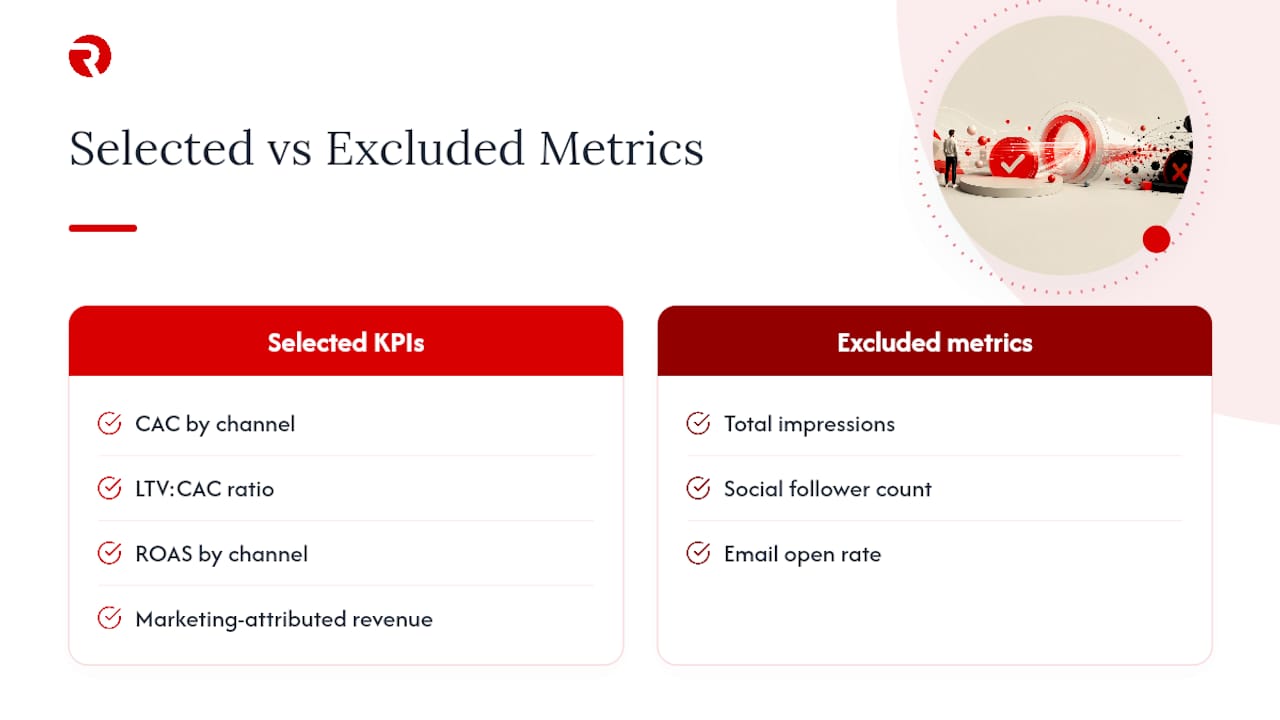
From those three questions, the team selected six strategic KPIs: CAC by channel, LTV:CAC ratio, ROAS by channel, marketing-attributed revenue, organic conversion rate by landing page, and email click-to-conversion rate. Metrics that were deliberately excluded included total impressions, social follower count, and email open rate — all present in the platform data, all irrelevant to the three core decisions.
Data sources connected were GA4, Google Ads, Meta Ads, Klaviyo, and the client’s Shopify-linked CRM. Each source was mapped with consistent UTM parameters and a shared attribution window of 7-day click, 1-day view. Dashboards refreshed daily, with a real-time pacing view for active paid campaigns.
The result was a weekly decision meeting that ran from 45 minutes to under 20, because the dashboard answered the standing questions before the meeting started. Reporting time dropped substantially — consistent with industry findings that well-structured dashboards cut reporting effort by roughly 80%. The client’s portfolio and outcomes are documented in Radkaadvertising’s case study library.
How do you choose the right metrics for your organisation?
The three-question audit works for every metric, every time. Ask: Does it answer a business question? Does it have an owner, a cadence, and a documented threshold? If any answer is no, remove it.
Prioritisation rule
- Strategic tier: 5–7 KPIs maximum. These are the metrics a CMO or board member reviews to assess commercial health.
- Channel tier: 8–12 KPIs per major channel. These are the metrics a channel lead reviews to assess channel efficiency.
- Operational tier: 8–12 KPIs per active campaign. These are the metrics a campaign manager reviews to make in-flight adjustments.
Never display all three tiers on one screen. The moment a strategic dashboard shows campaign-level CTR data, it stops being a strategic dashboard.
Avoiding common mistakes
- Vanity metrics (total followers, raw impressions without context) look impressive but do not connect to revenue decisions. Remove them from strategic and channel tiers.
- Mixing tiers on one screen creates cognitive overload and dilutes the signal.
- Missing timestamps mean users cannot tell whether the data is current. Every tile needs one.
- Inconsistent definitions across tools (different attribution windows, different conversion event definitions) produce numbers that cannot be compared. Agree definitions before you build.
Operationalising the checklist
- Assign a single owner to each metric — the person responsible for acting when a threshold is breached.
- Schedule a quarterly metric audit to remove metrics that have not triggered a decision in the prior quarter.
- Document thresholds in the dashboard itself, not in a separate document.
- Log decisions made from dashboards in a shared record so you can demonstrate the dashboard’s commercial value.
How do you integrate offline and multichannel data into marketing dashboards?
Offline data — event attendance, in-store sales, phone enquiries, direct mail responses — rarely arrives in a clean API feed. The practical approach is to assign UTM-equivalent tracking codes to offline campaigns (unique phone numbers, QR codes with tracked URLs, promo codes) and import the resulting data into your CRM on a defined schedule.
For multichannel attribution, the key is choosing one attribution model and applying it consistently across all channels rather than letting each platform report its own preferred model. Google Ads defaults to data-driven attribution; Meta defaults to 7-day click, 1-day view; your CRM may use first-touch or last-touch. Pick one model for your strategic dashboard, document it, and note the discrepancy in a footnote rather than trying to reconcile platform-reported numbers into a single figure.
Blending offline and online data typically requires a data warehouse layer (BigQuery or a similar tool) where both streams land before being visualised. For teams without data engineering resource, a simpler approach is a weekly manual import of offline conversion data into a shared Google Sheet that feeds into your dashboard tool via a connector.
Common mistakes that make marketing dashboards useless
The most common failure is building a dashboard from available metrics rather than from business questions. Dashboards built this way become unreadable, and teams revert to manual exports within weeks.
Metric overload is the second most frequent problem. Tracking 30–50 metrics feels thorough; it actually obscures the three metrics that matter. An initial audit that applies the three-question test often removes a substantial portion of dashboard metrics without losing decision-making power.
Stale data presented as current destroys trust faster than any design flaw. A dashboard showing last week’s spend as today’s figure will be abandoned. Always show last-updated timestamps and build alerts for failed refreshes.
No thresholds, no actions. A metric without a documented threshold is a number, not a signal.
Mixing audiences on one screen. A CMO dashboard that includes campaign-level creative performance data is trying to serve two audiences simultaneously and serves neither well. Separate tiers, separate screens.
Ignoring privacy-driven signal changes. Apple’s Mail Privacy Protection has made email open rates unreliable. iOS attribution changes have reduced the precision of paid social reporting. UK marketing teams building dashboards in 2026 need to account for these gaps explicitly, not pretend the old metrics still work the same way.
Why most dashboards fail before they are even built
The structural failure we see most often at Radkaadvertising is not a data problem or a tool problem. It is a tier-mixing problem. A client arrives with a single dashboard that shows board-level revenue figures alongside campaign-level creative performance data, all on one screen. Nobody uses it, because nobody knows which part of it they are supposed to act on.
The fix is almost always the same: split the single dashboard into three views, assign an owner and a meeting to each, and remove every metric that fails the three-question audit. Within a fortnight, the dashboard becomes the first thing opened in the weekly channel review rather than the last thing anyone checks.
Governance matters as much as design. A dashboard that is not attached to a recurring meeting or a documented decision process will be ignored within 60 days, regardless of how well it is built. Assign metric owners. Schedule the audit. Make the dashboard the agenda, not the appendix.
For UK teams specifically: GA4’s engagement rate is now the primary session-quality signal, and its definition (sessions over 10 seconds, or with a conversion, or with two-plus page views) needs to be written into your dashboard’s metric glossary. Teams still reporting bounce rate from GA4 are reporting a deprecated metric. The shift is not optional.
Radkaadvertising delivers managed analytics that drive real decisions
Faster decisions, consolidated data, and automated reporting — that is what a well-run analytics engagement actually delivers. It is exactly what Radkaadvertising builds for UK clients. Rather than a lengthy implementation project, the agency starts with a fixed-scope audit: mapping your existing metrics against the three-tier framework, identifying data-quality gaps, and delivering a prioritised dashboard build plan within two weeks.
The AI-driven growth and analytics service covers automated connector setup, anomaly detection, and ongoing dashboard governance so your team spends time acting on data rather than cleaning it. For teams that want to see the approach in practice before committing, the client case study library shows how the framework has been applied across e-commerce, B2B, and multi-market campaigns. Book a discovery call directly through the Radkaadvertising services page to scope a dashboard audit for your team.
Sources
- Marketing Dashboard: 15 Best Practices with Free Templates (2026)
- Why 80% of Marketing Dashboards Are Useless (And How to Build Yours Right) - Chillmetrics
- How to Choose KPIs for Marketing Dashboards | MetricsWatch
- What Is a Marketing Dashboard? Guide and Examples - Wrike
FAQ
What metrics should a marketing dashboard include?
Every marketing dashboard should include metrics that directly answer a business question and have a documented threshold for action. At the strategic tier, focus on marketing-attributed revenue, CAC, LTV:CAC ratio, ROAS, and conversion rate.
What are marketing dashboard metrics?
Marketing dashboard metrics are the specific, quantified signals — such as CAC, ROAS, CTR, and conversion rate — that a team monitors on a consolidated view to track performance and trigger decisions. The key distinction from raw platform data is that dashboard metrics are pre-selected, defined consistently, and tied to a specific business question.
What should a marketing dashboard include beyond metrics?
Beyond the metrics themselves, every dashboard needs a comparison period, a target or threshold, a last-updated timestamp, and an annotation area for significant events. Without these, a number has no context and cannot drive a decision.
How many metrics should a marketing dashboard show?
Limit strategic dashboards to 5–7 KPIs, channel dashboards to 8–12, and operational dashboards to 8–12 per campaign. Tracking more than this typically means the dashboard was built from available data rather than from business questions.
What is the 3-3-3 rule in marketing?
The 3-3-3 rule is not a single standardised framework; definitions vary across sources. A common interpretation in dashboard design is that each tier of a three-tier dashboard should focus on three core decisions, supported by no more than three to five metrics per decision. The principle aligns with the broader guidance that most teams make decisions with roughly three metrics, regardless of how many they track.