Ten action first ecommerce CRO fixes UK teams can ship this week

Fix structural friction before you touch a single headline. Speed up your pages, simplify mobile checkout, and clarify your product pages first, then test everything else.
TL;DR:
- Most ecommerce stores see an average conversion rate of around 1.67%, with mobile conversion rates typically lower than desktop, impacting overall performance.
- Fixing checkout issues such as forced account creation, hidden costs, and form complexity can recover significant revenue without a complete redesign.
- Optimizing product pages by presenting multiple images, videos, benefit-led copy, and addressing common objections boosts trust and conversion.
- Speed and performance improvements on mobile, including image compression, lazy-loading, and express payments, deliver the fastest conversion gains.
- Structural audits, prioritization using impact and ease scores, and disciplined testing create a sustainable CRO process that outperforms sporadic redesigns.
Table of Contents
- What is conversion rate optimization ecommerce, and what’s a good benchmark?
- How do you build a reliable baseline and segment it?
- How do you optimise product pages so they persuade rather than confuse?
- What checkout improvements actually recover lost revenue?
- Which mobile and performance fixes move the dial fastest?
- Which trust signals actually reduce purchase anxiety?
- How do you run tests correctly and measure meaningful impact?
- What’s the minimum toolset for ecommerce CRO?
- How do you turn an audit into a working CRO backlog?
- Ten quick wins you can ship this week
- What does this look like in practice for real stores?
- Personalisation strategies that actually earn their complexity
- How do heatmaps and session recordings inform your CRO priorities?
- What cart abandonment recovery tactics actually work?
- What role do user feedback and surveys play in conversion optimisation?
- How should CRO connect with email marketing and retargeting?
- Which advanced segmentation techniques sharpen CRO results?
- Where should small teams and scaling stores focus first?
- How Radkaadvertising helps you skip the trial and error
- Sources
- FAQ
What is conversion rate optimization ecommerce, and what’s a good benchmark?
Conversion rate optimization ecommerce means systematically improving the percentage of site visitors who complete a purchase, using data, testing, and structural fixes rather than guesswork. It’s the discipline that sits between traffic generation and revenue. You can spend a fortune on ads, but if your checkout leaks 70% of buyers; you’re pouring water into a cracked bucket.
The UK average conversion rate for online shoppers sat at about 1.67% in Q1 2026, according to Statista’s quarterly tracking. That figure moves with the season, the device mix, and the sector, so treat it as a compass, not a target. Rococo’s UK-focused benchmarking analysis makes the point well: fashion, electronics, and homeware all convert differently, and mobile traffic typically converts lower than desktop even when it drives more sessions.
The formula itself is simple: conversion rate = (conversions ÷ sessions) × 100. The complexity hides in the definitions. Are you counting sessions or unique users? Purchases only, or also newsletter signups and account creations as micro-conversions?
| Measurement factor | Why it distorts your numbers |
|---|---|
| Consent banners | Visitors who decline analytics cookies vanish from your session count |
| Cross-domain checkout | Separate checkout domains can break session continuity in GA4 |
| Attribution windows | Last-click models undercount assisted conversions from email or retargeting |
| Bot traffic | Inflates sessions without adding real buyers, quietly deflating your rate |
How do you build a reliable baseline and segment it?
- Set up GA4 (or your platform’s equivalent) to track sessions, purchases, and revenue as the core metrics, then confirm ecommerce tracking is firing on the actual purchase confirmation page, not the cart.
- Instrument micro-conversions: add-to-cart, checkout-start, and payment-info-entered. These show you exactly where the funnel narrows.
- Segment every report by device (mobile vs desktop), channel (organic, paid, email), and landing page. A blended average hides your worst-performing segment.
- Cross-check tracking against order counts from your ecommerce platform for a week. If GA4 and your backend disagree by more than a few percent, chase the discrepancy before trusting any test result.
- Document your consent-banner acceptance rate. It tells you what percentage of sessions you’re not seeing at all.
How do you optimise product pages so they persuade rather than confuse?
Product pages carry the entire weight of the buying decision, and most stores ask too little of them. Adobe’s guidance on ecommerce CRO puts page design and clarity at the centre of any tactical fix list, and the pattern holds across sectors: shoppers who can’t quickly answer “will this work for me?” simply leave.
Focus your effort here:
- Show at least four to six images per product, including a zoomed detail shot and one in genuine use context, not just a white background.
- Add short video for anything with texture, movement, or fit complexity, capped at 30 seconds and playing on mute by default.
- Write benefit-led copy above the fold, with full specifications and a size guide directly beneath, not buried in a separate tab.
- Include an objection-handling block addressing the top two or three hesitations customers raise in reviews or support tickets.
- Use urgency signals like stock counts sparingly and only when genuinely true, since fabricated scarcity erodes trust fast.
A structured approach to optimising product pages for higher sales also tends to improve organic visibility, since the same specificity that reassures shoppers also helps search engines understand what the page sells.
Pro Tip: Reading recent negative reviews before writing product descriptions helps address common buyer concerns upfront.
What checkout improvements actually recover lost revenue?
Checkout is where structural fixes pay off fastest, because you’re not persuading anyone of anything, you’re removing obstacles between a decision already made and a completed order. Baymard Institute’s checkout research consistently identifies forced account creation, hidden costs, and confusing form validation as the biggest abandonment drivers, and none of them require a redesign to fix.
Start here:
- Enable guest checkout as the default path, with account creation offered after purchase, never before.
- Cut form fields to the genuine minimum. Every unnecessary field is a chance for someone to give up.
- Show shipping costs and taxes before the final payment step, not as a surprise on the last screen.
- Offer at least two express payment options (a digital wallet alongside card payment) so returning customers can skip data entry entirely.
- Use inline validation with clear, specific error messages rather than a generic “something went wrong” banner.
- Add a visible progress indicator so shoppers know how many steps remain.
To find where your own checkout leaks, pull the step-by-step funnel report in GA4 and pair it with session replays at each drop-off point. Watching five real sessions where someone abandons at the payment step usually reveals the fix faster than any amount of theorising.
Which mobile and performance fixes move the dial fastest?
Mobile traffic dominates ecommerce sessions almost everywhere now, yet it still converts below desktop in most sectors, and slow load times are frequently the reason. Core Web Vitals offer diagnostic metrics such as Largest Contentful Paint, Interaction to Next Paint, and Cumulative Layout Shift to guide performance improvements on key mobile pages.
Fix performance before you touch design:
- Compress and lazy-load product images, since unoptimised imagery is the single most common cause of slow mobile load times.
- Defer non-critical scripts (chat widgets, marketing pixels) so they load after the main content renders.
- Enable browser and CDN caching for static assets to cut repeat-visit load times sharply.
- Make add-to-cart and checkout CTAs thumb-friendly, sized for one-handed use, and sticky on scroll for long product pages.
- Offer express payment buttons prominently on mobile, where typing card details is the most friction-heavy step in the entire journey.
Statistic Callout: UK online shopper conversion rates average around 1.67% across all devices combined, but mobile-specific rates typically sit lower, which means a slow mobile checkout doesn’t just lose a few sales. It drags your entire blended average down.
Which trust signals actually reduce purchase anxiety?
Shoppers hesitate at the exact moment they’re asked to hand over payment details, and trust signals work because they answer the unspoken question “what happens if this goes wrong?” Position them where that doubt actually surfaces, not just in a footer nobody reads.
- Display reviews with a verified-purchase tag directly beneath the price, not several scrolls down.
- Show security badges and accepted payment logos near the checkout button, not just on a separate “why trust us” page.
- State your returns window and delivery timescale in plain language close to the add-to-cart button.
- Surface your customer service contact method (live chat, phone number) on the checkout page itself, for the moment someone hesitates.
Test each addition individually where you can. Stacking five trust signals at once tells you nothing about which one actually earned the incremental sale.
How do you run tests correctly and measure meaningful impact?
Most failed CRO programmes don’t fail from bad ideas, they fail from bad test discipline. Optimizely’s framework for conversion rate optimization is built around exactly this: a clear hypothesis, sufficient sample size, and a measurement plan defined before the test launches, not after you like the result.
- Write every hypothesis in the same format: “If we change X, then Y will improve, because Z.” This forces you to state the mechanism, not just the guess.
- Estimate your required sample size and run-time before launch, using your current conversion rate and traffic volume. Low-traffic pages need longer test windows, sometimes several weeks, to reach a trustworthy result.
- Segment results by device, channel, and new-versus-returning visitor. A test that wins overall can be masking a loss in your highest-value segment.
- Track revenue per session (RPS) and retention alongside raw conversion rate. A test that lifts conversions but drops average order value may not be a genuine win.
- Never stop a test early because the early numbers look good. Early enthusiasm is usually noise, and stopping early is the single fastest way to ship a false positive.
- QA your analytics setup immediately after any winning test goes live permanently. Broken tracking after rollout has quietly erased more “wins” than any bad hypothesis ever has.
Pro Tip: If your store gets under 1,000 weekly sessions on the page you want to test, skip formal A/B testing there. Apply documented best practice instead and measure the before/after trend over a full month.
What’s the minimum toolset for ecommerce CRO?
You don’t need an expensive stack to start diagnosing conversion problems properly. GA4 handles funnel and conversion tracking. Microsoft Clarity adds free heatmaps and session recordings, showing you exactly where visitors hesitate, scroll past, or rage-click a broken element. Pair that with a lightweight A/B testing tool or a feature-flag system for running controlled experiments.
- GA4: funnel reports, micro-conversion tracking, segment comparison.
- Microsoft Clarity: heatmaps and session replay, free, no sampling limits for most stores.
- A basic experiment runner: for hypothesis testing once you’ve identified where to focus.
Paid personalisation and recommendation engines only add value once your structural foundation is solid. Layering AI-driven product recommendations onto a slow, confusing checkout just personalises the abandonment. Before adding any paid tool, confirm your consent management, event naming conventions, and experiment tagging are consistent, because broken attribution quietly invalidates every result built on top of it.
How do you turn an audit into a working CRO backlog?
A list of ideas isn’t a programme. You need a repeatable cadence that turns diagnosis into shipped, measured change.
- Diagnose: Build a leakage map combining funnel drop-off points, support ticket themes, and session-replay patterns. This tells you where the pain actually lives, not where you assume it does.
- Prioritise: Score every candidate fix using an ICE (Impact, Confidence, Ease) or RICE framework, then commit to just one to three items per sprint. Trying to fix everything at once means testing nothing properly.
- Deliver: Ship the change with proper QA, using staged rollout rules where your platform supports them, so a broken deployment doesn’t reach every visitor at once.
- Learn: Document the result, win or lose, and feed it back into the next diagnosis round. This is what separates a one-off redesign from an actual optimisation habit.
This diagnose, prioritise, deliver, learn loop is standard practice across documented ecommerce CRO programmes, and its real value is pacing. Teams that ship one well-measured change every sprint consistently outperform teams that attempt a full redesign once a year.
Ten quick wins you can ship this week
- Enable guest checkout. Low effort, high impact.
- Show your returns policy near the add-to-cart button. Low effort, medium impact.
- Compress product images sitewide. Low effort, high impact on mobile speed.
- Add one express payment option. Medium effort, high impact.
- Add verified-purchase review snippets to product pages. Medium effort, medium impact.
- Display shipping costs before the final checkout step. Low effort, high impact.
- Make your primary CTA sticky on mobile product pages. Low effort, medium impact.
- Fix the top three broken-link or error-state issues in checkout. Medium effort, high impact.
- Add a size guide link directly beside sizing options. Low effort, medium impact.
- Defer non-essential scripts to speed up first paint. Medium effort, high impact.
Pro Tip: Measure results after one full business cycle, not one week. Weekly sales swing with payday, promotions, and seasonality far more than most people expect.
What does this look like in practice for real stores?
The diagnose, prioritise, deliver, learn approach isn’t theoretical. It’s how Radkaadvertising structures every ecommerce engagement: start with a structural audit, fix what’s broken, then test what’s uncertain.
Diagnosing before designing sounds obvious, but most teams do the opposite. They redesign the homepage because it “feels dated,” then wonder why conversion barely moved, because the actual leak was a confusing shipping-cost surprise three steps into checkout.
A typical process looks like this: audit the funnel and session replays to find the real leak, ship a targeted fix (often checkout or product-page clarity), then validate the change with a proper test rather than assuming it worked. Radkaadvertising’s case study portfolio documents this process across ecommerce and brand clients. If you want a similar diagnostic run on your own store, that’s exactly the conversation worth starting.
Personalisation strategies that actually earn their complexity
Personalisation only pays off once your baseline experience is solid, because personalising a broken journey just gives each visitor their own version of the same problem. Once your product pages and checkout are clean, targeted personalisation becomes genuinely powerful.
Start simple: show recently viewed products, or surface stock availability messaging tailored to browsing behaviour. These require no complex machine learning, just consistent data tracking.
Behavioural segmentation adds the next layer. Returning visitors who abandoned a cart last week can see a subtly different homepage than a first-time visitor arriving from a paid search ad. Geolocation-based delivery estimates (“arrives by Thursday if ordered today”) reduce a specific type of anxiety that generic messaging can’t touch.
Onsite personalisation works best when it answers a question the visitor is already asking, not when it tries to manufacture urgency they didn’t feel. A “back in stock” banner for an item someone previously viewed feels helpful. A countdown timer with no real deadline feels manipulative, and shoppers increasingly notice the difference.
Save the heavier investment (dynamic recommendation engines, AI-driven merchandising) for once you’ve confirmed the structural basics convert well. As Supermetrics notes in its ecommerce CRO guidance, structural fixes should come before personalisation layers, not alongside them, because personalisation amplifies whatever experience already exists, good or bad.

How do heatmaps and session recordings inform your CRO priorities?
Behavioural analytics show you what people actually do, which is frequently different from what your funnel report implies. A drop-off at the shipping step might look like a pricing problem in GA4, until a session recording shows visitors repeatedly clicking a shipping-cost tooltip that doesn’t work.
Heatmaps reveal where attention concentrates and, more usefully, where it doesn’t. Click maps also expose “false affordance,” where visitors click on elements that look interactive but aren’t, a strong sign your design language is misleading people.
Session recordings add the narrative context heatmaps can’t. Watching someone repeatedly re-enter a postcode that keeps failing validation tells you more in ninety seconds than a week of aggregate funnel data. Microsoft Clarity offers both heatmaps and session replay free, with no sampling limit for most stores, making it a sensible first stop before investing in anything paid.
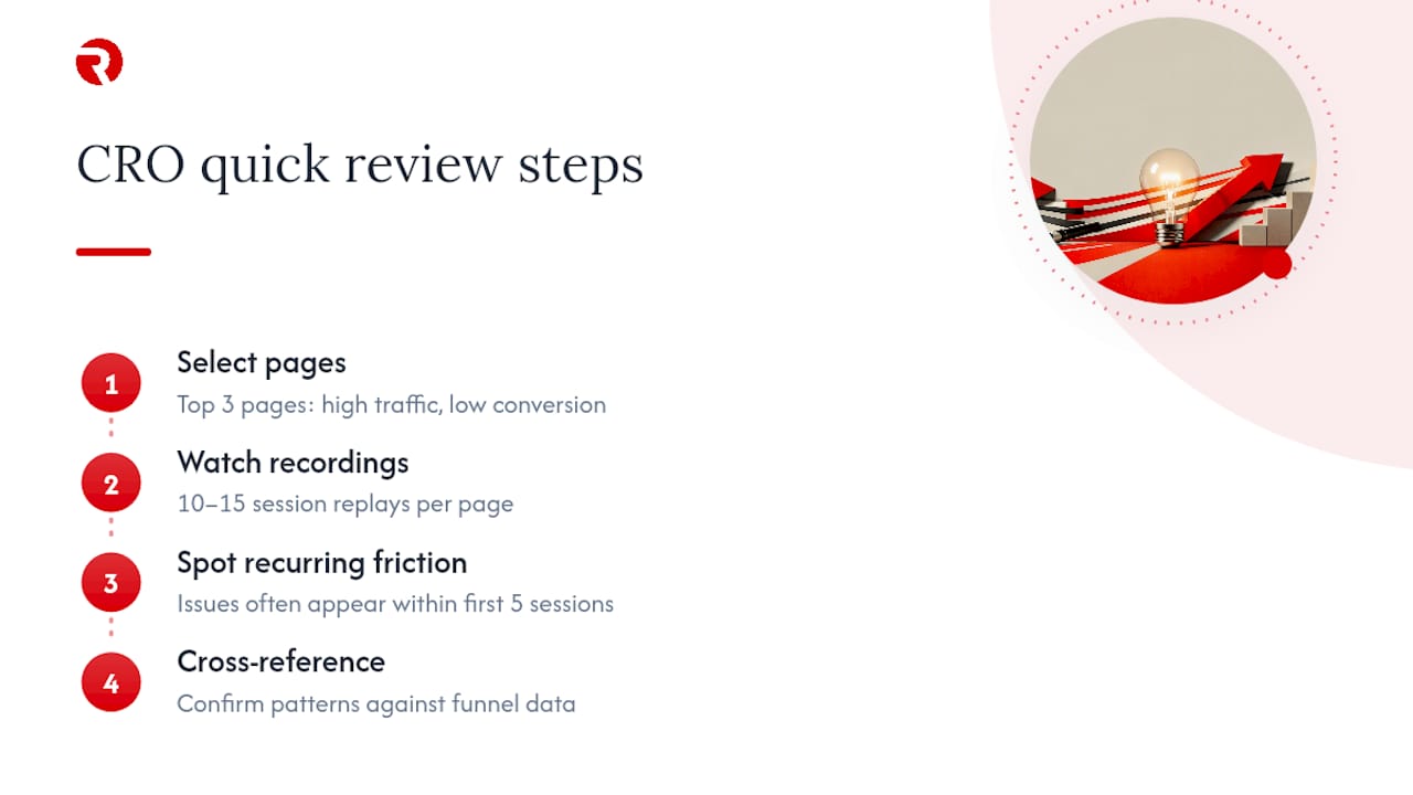
The practical approach: pick your three highest-traffic pages with the worst conversion-to-traffic ratio, watch ten to fifteen session recordings on each, and note recurring friction points. Patterns usually emerge fast, often within the first five sessions. Cross-reference what you see against your funnel data to confirm the behaviour you’re watching is actually widespread, not a single confused visitor having a bad day.
What cart abandonment recovery tactics actually work?
Cart abandonment sits close to 70% across most ecommerce sectors, and recovery tactics split into two categories: preventing it, and recovering from it after the fact.
Prevention comes first, and it overlaps heavily with checkout fixes already covered: early cost disclosure, guest checkout, and clear error states remove most of the avoidable abandonment before it happens. Recovery tactics catch what’s left.
Automated abandoned-cart emails remain one of the highest-return tactics available, particularly when the first message goes out within an hour and simply reminds the shopper what they left, without discounting immediately. A second email 24 hours later can introduce a modest incentive if margin allows, but leading with a discount trains customers to abandon carts deliberately, waiting for the coupon.
On-site exit-intent prompts catch desktop abandonment before it happens, offering a reason to stay (free shipping threshold, a limited-time offer) rather than a generic “wait, don’t go” message. Retargeting ads across social and display networks extend the recovery window for shoppers who left without providing an email address at all.
Track your abandoned-cart recovery rate separately from your overall conversion rate. A healthy recovery sequence typically recovers a meaningful slice of abandoned revenue, and if yours recovers close to nothing, the sequence itself, not the shopper’s intent, is usually the problem.
What role do user feedback and surveys play in conversion optimisation?
Quantitative data tells you where people drop off. Feedback tells you why, and the two together prevent you from optimising the wrong thing.
An exit-intent survey with a single open question (“what stopped you completing your purchase today?”) captures reasons no funnel report will ever reveal, things like “I wanted to compare with a competitor” or “I couldn’t find the returns policy.” Post-purchase surveys serve a different purpose: they surface friction that didn’t stop the sale but nearly did, valuable early warning for problems about to get worse.
On-page feedback widgets, the small “was this page helpful?” prompts, work particularly well on product and FAQ pages, where a low score paired with a specific comment often points straight to a content gap. Customer service transcripts and return-reason data are underused feedback sources too, frequently repeating the same two or three objections that a product page could resolve upfront.
Treat qualitative feedback as hypothesis fuel, not proof. If ten survey respondents mention confusing sizing, that’s a strong signal to test a clearer size guide, not a certainty that fixing it will lift conversion by any specific amount. Validate the fix with actual behavioural data once it ships.
How should CRO connect with email marketing and retargeting?
CRO and lifecycle marketing are often run by separate teams, which wastes the compounding value each generates for the other. A checkout fix that reduces friction also improves the conversion rate of every retargeting click sent to that same checkout.
Segment your email flows by the same behavioural data informing your CRO programme. Someone who abandoned at the payment step needs a different message than someone who browsed three product pages and left. The former needs reassurance about payment security or delivery cost; the latter probably needs a nudge back to consideration.
Retargeting ads should point to the specific page that matches user intent, not a generic homepage. Someone who viewed a product but didn’t add it to cart should see an ad for that product, landing on a page that’s already been optimised for clarity and speed, because sending well-targeted traffic to a weak page wastes the targeting entirely.
Test your retargeting landing experience with the same rigour as your main site. A dedicated landing page for high-intent retargeted traffic, stripped of navigation distractions and focused on a single product, frequently converts noticeably better than sending that traffic back to the standard product page. Measure it, don’t assume it.
Which advanced segmentation techniques sharpen CRO results?
Blended averages hide your best and worst-performing segments equally, which means broad “improve conversion” efforts often help nobody in particular. Advanced segmentation fixes this by tailoring fixes to the segment where they’ll actually matter.
Segment by purchase intent stage: first-time visitors need trust-building content, while returning visitors with past purchases respond better to speed and familiarity. Segment by traffic source too, since a shopper arriving from a comparison-shopping engine already knows your price point and needs different reassurance than one arriving from a brand-awareness social ad.
Device-based segmentation deserves particular attention, since mobile and desktop behaviour genuinely differ, not just in conversion rate but in what causes hesitation. Geographic segmentation matters for delivery-cost sensitivity; customers further from your fulfilment centre care more about accurate delivery estimates than price.
RFM segmentation (recency, frequency, monetary value) helps prioritise which customer segments deserve personalised experiences first. High-value repeat customers justify investment in a tailored experience faster than low-value one-time visitors ever will. Layer these segments over your testing programme too: a checkout fix that lifts conversion 5% for new visitors might do nothing for returning customers who were never going to abandon anyway, and that distinction changes what you build next.
Where should small teams and scaling stores focus first?
If you’re running a lean team with modest traffic, skip formal A/B testing on most pages. You won’t reach statistical confidence fast enough to justify the wait. Apply documented best practice instead: fix checkout friction, compress your images, and clarify your product pages using the patterns Baymard’s research and Adobe’s guidance both confirm work broadly. Measure the trend over a full month rather than chasing weekly noise.
If you’re scaling with genuine traffic volume, testing discipline becomes worth the investment. Run structured experiments, segment relentlessly, and resist the urge to stop a test the moment it looks promising.
Either way, the priority order stays the same: structural fixes first, testing second, personalisation last. Small, measured wins compound faster than any single big redesign ever will.
— Bart
How Radkaadvertising helps you skip the trial and error
Running audits, prioritising fixes, and testing them properly takes time most ecommerce teams don’t have alongside the day-to-day of running a store. A managed route through exactly that process is offered: structural audits covering speed, checkout, and product pages, a prioritised fix backlog built on impact versus effort, hands-on implementation, and disciplined testing to confirm what actually moved revenue rather than what merely felt like an improvement.
The agency’s service scope covers the full path from diagnosis through to delivery, drawing on the same brand strategy and digital marketing expertise documented across its client work. If you want to see how this plays out for stores similar to yours, the case study portfolio is the clearest starting point, and requesting a similar audit for your own store is the natural next step from there.
Sources
- Conversion rate of online shoppers in Great Britain from 1st quarter 2024 to 1st quarter 2026 | Statista
- 16 Actionable Ecommerce Conversion Rate Optimization Tips | Baymard Institute
FAQ
What is a good conversion rate for ecommerce?
There’s no single universal figure, since it varies by sector and device, but UK online shoppers converted at roughly 1.67% on average in early 2026. Compare your own rate against your vertical and your historical trend rather than that headline number alone.
How do you improve conversion rate in ecommerce?
Fix structural friction first, page speed, mobile checkout, and product-page clarity, then run disciplined, hypothesis-driven tests to validate further changes. A structured diagnose, prioritise, deliver, learn framework keeps this repeatable rather than a one-off effort.
Is a 12% conversion rate on a website good?
If it genuinely reflects completed purchases, it likely points to a very high-intent traffic source rather than typical browsing traffic.
What is the difference between SEO and CRO?
SEO focuses on attracting visitors to your site through organic search visibility, while conversion rate optimization ecommerce focuses on turning the visitors you already have into customers. The two work best together: SEO brings qualified traffic, and CRO makes sure that traffic doesn’t leak away at checkout.
How often should you test changes to your store?
Run one well-measured test per sprint rather than several at once, since overlapping tests make it hard to attribute results correctly. For low-traffic pages, favour applying documented best practice and measuring trend over a full month instead of formal testing.