Marketers: Use a 5 Step Competitive Positioning Map to Decide Strategy

A competitive positioning map is a two-axis visual that plots how customers perceive your brand against rivals, exposing clusters, gaps, and genuine differentiation. Build one to answer a single strategic question, whether that’s where to launch, how to price, or what to say differently. The next move is picking that question before you touch a single axis.
TL;DR:
- Positioning maps are most effective when focused on specific strategic questions like market entry, pricing, or differentiation, not operational decisions.
- Building an accurate map requires selecting 3 to 8 competitors based on sales data and sourcing evidence from surveys, reviews, and customer interviews.
- Axes should reflect independent and measurable buyer language, with well-documented scoring rubrics, to ensure the map accurately reveals market gaps and clusters.
- Clusters indicate commoditized markets needing differentiation, while white space signals require validation through buyer demand signals before acting.
- Updating the map quarterly using triangulated evidence and involving sales and customers in sanity checks keeps it relevant and trustworthy for ongoing strategy.
Table of Contents
- What is a competitive positioning map?
- When should you build a positioning map?
- How do you build a competitive positioning map step by step?
- Which axis pairs and scoring methods actually work?
- How do you interpret clusters, white space, and dead gaps?
- What mistakes ruin a positioning map?
- How often should you update the map?
- What do real-world positioning map examples look like?
- Which tools and templates make this easier?
- How does a positioning map fit into wider strategic planning?
- What agencies get right (and wrong) about positioning maps
- Get help building your positioning map with Radkaadvertising
- Primary sources and further reading
- Sources
- FAQ
What is a competitive positioning map?
A perceptual map and a positioning map get lumped together constantly, but they measure different things. A perceptual map is built from customer research and shows how buyers actually perceive your brand and competitors on chosen attributes, capturing the perception differences and distances between brands that reveal market position and opportunity. A positioning map, by contrast, reflects where a company intends or claims to sit strategically, often drawn from internal goals rather than buyer surveys.
The distinction matters because perceptual maps use consumer data while positioning maps capture a company’s intended strategic position, and the two rarely match perfectly. That mismatch is often the most useful finding of the whole exercise.
Overlaying both versions on one chart shows reality against ambition:
- Where the brand thinks it sits versus where customers place it
- Which competitors have drifted from their stated positioning
- Whether a rebrand or repositioning campaign has actually shifted perception
A simple example: a skincare brand plots itself as “premium” on price but customers rate its perceived benefit closer to mid-market rivals. That single gap, visible in seconds on a chart, is worth more than a dozen pages of brand tracking data.
When should you build a positioning map?
A positioning map earns its place when a specific decision is on the table. Four situations come up most often:
- Market entry — deciding whether a new market has room for your value proposition or is already saturated in your target quadrant.
- Pricing decisions — checking whether a proposed price sits where perceived value actually supports it.
- Product differentiation — spotting which features or attributes competitors have neglected.
- Messaging refresh — confirming your claimed positioning still matches how buyers describe you unprompted.
A map is the wrong tool for purely operational questions, like choosing a fulfilment partner or fixing a checkout flow. Nothing about perception plotting helps there. Good positioning maps are scoped to answer one strategic question rather than built as a broad, decorative visual, so write that question down first: “Should we enter the mid-market segment?” not “What does our competitive landscape look like?” The second question produces a pretty chart nobody acts on.
How do you build a competitive positioning map step by step?
The process runs in five stages, and skipping any of them is exactly how teams end up with a chart that looks authoritative and means nothing.
- Scope the decision and pick your competitor set. Name the exact question the map must answer, then choose 3 to 8 competitors. Pull that list from closed deal notes and sales conversations rather than a generic Google search, since a practical mapping process uses deal data and sales input to select the competitor sample so the map reflects real competitive encounters.
- Choose your axes from buyer language, not internal opinion. Sit in on three to five sales calls or customer interviews and note the exact words buyers use to compare options. Test each candidate axis for independence (does it move separately from other axes?) and measurability (can you score it with evidence, not gut feel?).
- Collect data from multiple sources. Surveys and customer interviews, review sites, pricing pages, job postings (they reveal where competitors are investing), and product demos all feed the map. Recommended evidence sources include surveys, reviews, pricing pages, job postings, and product trials, because triangulation across at least three sources per competitor prevents single-source bias.
- Score each competitor against a written rubric. Define what a 1 and a 5 look like on each axis before you score anyone. Normalise scores to a common scale, and record the evidence behind every number, a review quote, a pricing screenshot, a sales call note, so the score survives scrutiny six months later.
- Plot, sanity-check, and iterate. Put the scores on the chart, then show it to sales and a handful of customers before presenting it anywhere else. If a salesperson says “that’s not how it feels in the field,” the map is wrong, not the salesperson.
Pro Tip: Run the sanity check as a five-minute conversation, not a formal review. Ask one salesperson and one customer, separately, to place your brand on the map blind before you show them your version. If their instinctive placement matches yours, the map is solid.
Which axis pairs and scoring methods actually work?
Not every axis pair spreads competitors usefully. The traits that separate a useful axis from a decorative one are independence, measurability, and relevance to how buyers actually choose.
- Independent: the axis shouldn’t move in lockstep with another axis on your chart.
- Measurable: you can assign a defensible score using evidence, not impression.
- Meaningful to buyers: it should echo language customers use unprompted, not internal jargon.
Axis pairs that reliably spread a competitor set include price versus perceived quality, ease of use versus feature depth, and speed of implementation versus customisation. Insiders warn that axis pairs which are partially correlated, such as feature depth against price, tend to create diagonal clustering that erases distinct quadrants, so test any candidate pair against your data before committing to it.
Document the rubric in a shared sheet: each score gets a one-line justification and a source link. This turns a subjective exercise into something a colleague can audit and challenge, which is exactly the point.
Pro Tip: If every competitor scores between 3 and 4 out of 5 on an axis, that axis is doing no work. Swap it for one that actually separates the field.
How do you interpret clusters, white space, and dead gaps?
Once the map is plotted, the real work starts: turning dots on a chart into decisions.
- Clusters are red zones. A tight group of competitors on similar coordinates signals a commoditised space. Either differentiate hard within it or avoid competing there directly.
- White space needs validation, not celebration. An empty quadrant is only an opportunity if buyers actually want what it represents. A gap only qualifies as validated white space when demand signals such as buyer requests, forum posts, or feature requests on review sites back it up, otherwise you’re looking at a dead gap nobody’s asking to fill.
- Distance from competitors informs messaging and pricing. The further you sit from the nearest rival on a meaningful axis, the sharper your positioning line can be.
- Re-score quarterly. Markets shift faster than most brand decks admit, and a map built last year on last year’s competitor set is a historical document, not a strategic one.
- Some signals demand immediate action: a competitor launching a feature that collapses your differentiation axis overnight is not a quarterly-review issue.
What mistakes ruin a positioning map?
Most flawed maps fail for the same handful of reasons, and every one is avoidable.
- Vague or correlated axes. “Innovation” means nothing without a measurable definition. Test candidate axes against real deal notes before locking them in.
- Relying only on internal opinion. Marketing and sales teams have biases baked in. External evidence, reviews, pricing pages, customer interviews, keeps the map honest.
- Too many competitors. Beyond eight, the chart turns into visual noise. Limit the set and revisit it as the market shifts.
- Treating the map as a one-off deliverable. A map built once and filed away loses accuracy within a quarter or two.
- Missing provenance. If nobody can trace a score back to its evidence, nobody will trust it during the next strategy debate.
Pro Tip: Keep a “score changed” log alongside the map. When a competitor’s position shifts between quarters, note why. That log becomes some of the most useful competitive intelligence your team owns.
How often should you update the map?
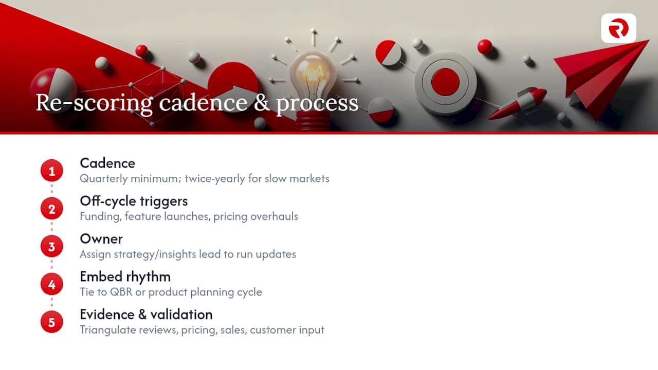
Quarterly re-scoring is the practical minimum for most categories, tighter if you’re in a fast-moving sector like software or D2C, looser (perhaps twice yearly) in slow-moving industrial or regulated markets. The trigger isn’t the calendar alone: a competitor’s funding round, a major feature launch, or a pricing overhaul should prompt an off-cycle re-score regardless of when the last one happened.
Operationalising the map means giving it an owner, not letting it float between departments. Typically that’s a strategy or insights lead who collects fresh evidence each cycle, updates the rubric where needed, and circulates the revised chart to sales, product, and marketing before it’s filed anywhere. Build the re-scoring into an existing rhythm, a quarterly business review or product planning cycle, rather than creating a standalone calendar event nobody prioritises.
The evidence trail matters as much as the update frequency. Each re-score should reference the same triangulated sources as the original: reviews, pricing pages, sales notes, and direct customer input. Without that consistency, a map drifts into guesswork within a year, and the team loses the ability to say with confidence whether a competitor has genuinely moved or whether someone just felt like adjusting a dot.
Treat validation as ongoing, not a one-time gate. Win-loss interviews with sales are the fastest cross-check: if deals are being lost to a competitor the map places far from your strength axis, either the map or the sales narrative is wrong, and it’s worth finding out which.
What do real-world positioning map examples look like?
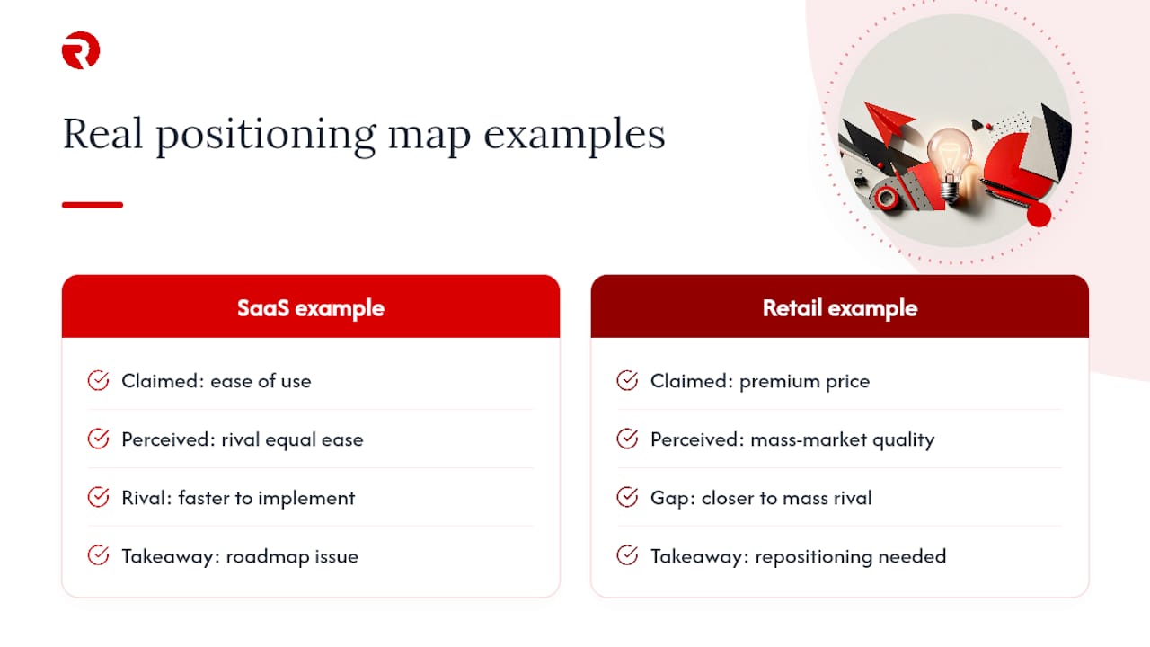
Positioning maps tend to prove their worth in categories where perception and reality have quietly drifted apart. A software company convinced it owned the “ease of use” quadrant discovers, once it plots actual review language from G2 or Capterra against a rival’s, that customers rate the rival as equally simple to use but faster to implement. That’s not a marketing problem, it’s a roadmap problem, and the map is what surfaces it before a renewal cycle makes it obvious the hard way.
Retail and consumer categories show the pattern just as clearly. A brand plots itself as premium on price but discovers its perceived-quality score sits closer to a mass-market competitor than to the luxury tier it wants to occupy. Perceptual mapping exists precisely to expose these blind spots and unmet needs by showing how customers perceive a brand relative to rivals, and the gap between claimed and perceived position is usually where the next campaign brief should start.
The common thread across categories: the map rarely confirms what the team already believed. It’s most valuable exactly when it contradicts internal assumptions, because that contradiction is the signal that perception work, messaging, or product investment needs to shift. Competitive perception mapping captures the market that exists inside customers’ minds, not the market implied by an org chart or a feature comparison sheet, and that’s the version of “competitive landscape” that actually predicts buying behaviour.
Which tools and templates make this easier?
You don’t need specialist software to build a credible map. A spreadsheet with a scatter chart function, Google Sheets or Excel, handles the plotting perfectly well once your scores are normalised, and it keeps the rubric and evidence links in the same file as the visual.
For teams that want more polish, general-purpose diagramming and whiteboard tools (the kind already used for journey mapping or workshop facilitation) offer positioning map templates with drag-and-drop quadrants, which speeds up the plotting step once scoring is done. Presentation software works fine too for the final version that goes into a strategy deck, provided the underlying data lives somewhere more durable and auditable.
The tool matters far less than the discipline behind it. A beautifully designed chart built on unvalidated internal opinion is worse than a rough scatter plot backed by triangulated evidence from surveys, reviews, pricing pages, and job postings. Whatever software you choose, keep three things attached to every version: the scoring rubric, the evidence source for each score, and the date it was last validated. That combination is what turns a chart into a decision-making asset rather than a slide that gets glanced at once and forgotten.
How does a positioning map fit into wider strategic planning?
A positioning map is only useful when it feeds decisions that were already on the strategic calendar, brand strategy reviews, product roadmap prioritisation, pricing committees, and messaging or campaign planning. Treat it as an input to those processes rather than a stand-alone artefact that lives in a folder nobody reopens.
Practically, that means scheduling the map’s outputs to land just before the meetings they’re meant to influence. If pricing gets reviewed every autumn, the map’s price-versus-value axis should be freshly re-scored the month before that review, not six months stale. If a messaging refresh is planned for a product launch, the perception axes relevant to that launch need current evidence, not last year’s review scrape.
The map also earns its keep as a shared reference point across departments that otherwise argue from different assumptions. Product teams often see competitive gaps in feature terms; sales sees them in win-loss terms; marketing sees them in share-of-voice terms. A single map, built from triangulated evidence with a documented rubric, gives all three groups the same starting point for a conversation, which shortens strategy meetings considerably and reduces the number of “well, it doesn’t feel that way to me” arguments that stall decisions.
What agencies get right (and wrong) about positioning maps
Most positioning map failures I’ve seen trace back to one thing: nobody defined the decision before building the chart. Scoping consistently eats 20 to 30 percent of a well-run project’s timeline, and that’s not inefficiency, it’s the part of the work that determines whether anything downstream gets acted on. Teams that rush past scoping to get to the “fun” part, plotting dots, tend to produce maps that look sophisticated and change nothing.
The other recurring failure is treating the map as a design exercise rather than a research exercise. A gorgeous chart built on guesswork is more dangerous than a rough one built on evidence, because polish creates false confidence. Positioning work always starts with the strategic question, then folds the map into messaging and identity decisions rather than presenting it as a stand-alone deliverable.
Here’s a checklist worth handing to any product, sales, or marketing team running a mapping sprint: agree the decision first, cap the competitor set at eight, source every score from evidence rather than opinion, sanity-check with a salesperson before finalising, and put a re-score date on the calendar before you close the project.
— Bart
Get help building your positioning map with Radkaadvertising
This agency offers an alternative to guessing your way through a positioning exercise with a template and no research budget behind it. Where most teams either buy generic software or hire a generalist freelancer, a bilingual, cross-cultural approach means the scoping, customer research, and messaging work happens under one roof, with strategy and creative talking to each other from day one rather than handed off cold.
If you need the full process, buyer interviews, axis testing, scoring, plotting, and the messaging work that follows, our Brand Identity & Strategy service covers exactly that scope. Teams that also need ongoing competitor and market signal tracking often pair it with the AI Growth Package for continuous data collection between quarterly re-scores.
Book a discovery call through our services page and ask for a sample positioning map deliverable before you commit to anything larger.
Primary sources and further reading
These sources anchor the scoring and validation method covered above and are worth bookmarking as templates for your own rubric:
- How to Use Perceptual Mapping to Assess Your Competition — the foundational case for perception-based mapping.
- How to Build a Competitive Positioning Map That Reveals Market Gaps — practical axis and triangulation guidance.
- Difference between a Perceptual Map and a Positioning Map — clears up the terminology confusion.
- Competitive positioning (Shopify blog) — on scoping discipline and decision framing.
Sources
- How to Use Perceptual Mapping to Assess Your Competition
- How to Build a Competitive Positioning Map That Reveals Market Gaps
- Difference between a Perceptual Map and a Positioning Map
- Competitive Perception Mapping: How Customers Really See Your Brand (and Why It Changes Everything)
- Competitive positioning (Shopify blog)
FAQ
What is a competitive map?
A competitive map is a visual chart, usually two axes, that plots your brand against rivals on attributes that matter to buyers, revealing clusters, gaps, and relative distance between competitors.
What does competitive positioning mean?
Competitive positioning is the deliberate choice of how a brand wants to be perceived relative to rivals on attributes like price, quality, or convenience, and it’s the strategic intent a positioning map is meant to test against reality.
What is a positioning map?
A positioning map plots a company’s intended or claimed strategic position, distinct from a perceptual map, which plots how customers actually perceive brands based on their own research and experience.
What are the four types of positioning?
Common strategic positioning types include price or value, quality or premium, niche or focus, and convenience, each of which implies a trade-off in what the brand gives up to own that position, with innovation sometimes named as a fifth.
How much does agency support for a positioning map cost?
Pricing depends on scope; current service pricing, including brand strategy work, is listed on the Radkaadvertising services page.