3 Checkout Optimization Fixes Managers Must Run First

Checkout optimisation reduces cart abandonment and lifts revenue without you needing a full redesign. Test three things first: show every cost upfront, strip your checkout down to a guest-first flow with the fewest fields possible, and add express payment options with genuine mobile tuning. Run each as a proper test. Prevention beats recovery every time.
TL;DR:
- Showing all costs upfront is the most effective fix, as unexpected shipping fees cause up to 55% of checkout abandonments.
- Implementing guest checkout with minimal form fields and autocomplete can recover up to 25% of lost revenue by reducing friction.
- Offering Apple Pay, Google Pay, and other express options can boost mobile conversions by several percentage points with minimal engineering effort.
- Prioritizing cost transparency, mobile thumb-friendly design, and trust signals significantly impacts conversion rates more than aesthetic redesigns.
- Testing should focus on one variable at a time over two to four weeks, measuring key metrics like conversion rate, revenue per session, and device-specific abandonment.
Table of Contents
- What is checkout optimization and why does it matter?
- High-impact best practices to test
- How do you test and measure checkout changes?
- How delivery and post-purchase promises fit into checkout optimisation
- Recovery tactics: abandoned-cart flows, SMS and retargeting
- A prioritised checklist to run this quarter
- How Radka Advertising approaches checkout optimisation
- Security best practices to protect customer data during checkout
- Personalisation techniques to tailor the checkout experience
- Multi-currency and multi-language support for global customers
- An editor’s take on getting your priorities right
- Get expert help optimising your checkout
- Sources
- FAQ
What is checkout optimization and why does it matter?
Checkout optimisation is the practice of removing friction between “add to basket” and “order confirmed” so more visitors who intend to buy actually complete the purchase. It covers everything from form design and payment options to page speed and the trust signals sitting next to your card fields.
The scale of the problem is why it deserves board-level attention. Not every abandoned cart was ever going to convert. Roughly 40 to 43% of abandoned baskets belong to browsers and comparison shoppers who were never going to check out that session, no matter how smooth the process. That leaves a substantial, genuinely fixable chunk of abandonment caused by friction you can remove.
The single biggest checkout killer: unexpected shipping costs cause between 39% and 55% of checkout abandonments, making cost transparency the highest-leverage fix available to most stores. Nothing else on this list comes close in scale.
That one statistic should reorder your entire testing roadmap. Before you touch button colours or checkout page layouts, ask whether your customer knows the full price of their order before they reach the final screen. If the answer is no, that is where the money is being lost.
High-impact best practices to test
Every fix below has a clear mechanism, an expected impact range, and a specific test you can run without months of engineering work. Work through them roughly in this order.
-
Show all costs before the checkout page. Shipping, taxes and any handling fees should appear on the product page or cart, not as a surprise on step three. This single change frequently outperforms cosmetic checkout redesigns for the engineering hours it costs, because it removes the number one reason people bail.
-
Add a free-shipping progress bar. A bar reading “spend £12 more for free delivery” nudges basket size up while reinforcing that shipping costs are known, not hidden. Test it against a static banner to see whether the dynamic element earns its keep.
-
Default to guest checkout and cut form fields to the essentials. Baymard’s research finds an optimised checkout should carry roughly 12 to 14 total form elements, with 7 to 8 input fields as the target. Account creation should be an offer after purchase, never a gate before it.
-
Add address autocomplete and inline validation. Autocomplete removes typing; inline validation catches a mistyped postcode or expired card before submission, rather than after a failed payment attempt. Combined with guest-first design and express payments, these changes can recover an estimated 15 to 25% of otherwise lost revenue.
-
Offer express payments and wallets. Apple Pay and Google Pay turn a multi-field form into a single tap. Payment-provider data shows adding a relevant payment method can lift conversion by several percentage points while prebuilt payment components cut the engineering lift usually needed to ship them. Buy-now-pay-later works well for higher-ticket or fashion categories; it adds little for a £15 impulse purchase.
-
Design mobile checkout for thumbs, not desktops. Numeric keyboards for card and phone fields, a single-column layout, and a checkout button sitting inside the natural thumb zone all matter more than they sound. For stores with mobile-heavy traffic, these specific UX choices tend to move conversion more than anything else on this list.
-
Put trust signals where the doubt actually happens. Payment logos, a one-line returns policy, and a small SSL or security mention belong beside the card fields themselves, not buried in the footer.
-
Keep a persistent order summary and a visible progress indicator. Shoppers should always see what they are paying and how many steps remain. Both reduce the anxious “how much longer is this” abandonment that has nothing to do with price.
-
Never redirect to a third-party payment page that looks nothing like your site. A visual jump to an unbranded page is one of the more avoidable trust breaks in checkout page design.
-
Make discount code entry visible but not distracting. An empty, prominent “have a code?” box that nobody uses invites people to open a new tab to hunt for one. A collapsed link works better for most stores.
-
Cut load time on every checkout step. Compress images, defer non-essential scripts, and measure real load time on 4G, not office Wi-Fi.
Pro Tip: Run the cost-transparency fix first, on its own, before touching anything else on this list. It is the cheapest change to ship and the one most likely to show a measurable lift within a fortnight, which gives you a result to justify the next round of tests.
How do you test and measure checkout changes?
A/B testing only tells you the truth if you change one variable per test and let it run to statistical relevance rather than stopping the moment a graph looks promising. As a working rule, plan for a minimum of two to four weeks per test, longer for lower-traffic stores, and resist the urge to declare a winner after a good Tuesday.
Track more than your headline conversion rate:
- Checkout conversion rate by step, so you can see exactly where people drop off.
- Revenue per session, which catches cases where a change lifts conversion but shrinks average order value.
- Step-by-step drop-off rates, isolating whether the shipping page or the payment page is the leak.
- Device split, since UK abandonment data shows mobile abandonment running well above desktop, which justifies testing mobile and desktop experiences separately rather than assuming one fix serves both.
Segment every result by traffic source and by new versus returning visitors. A returning customer with saved payment details behaves nothing like a first-time visitor from a Meta ad, and pooling them together hides both stories. When a test result confuses you, session replays and heatmaps usually explain the “why” behind the “what”. A single-question exit survey (“what stopped you completing your order?”) on the checkout page can surface issues no analytics dashboard will show. Reading tools like these alongside a structured conversion rate optimisation framework keeps testing disciplined rather than reactive.
How delivery and post-purchase promises fit into checkout optimisation
Shipping is not a logistics afterthought bolted onto the end of checkout. It is one of the biggest levers in the entire process. Unexpected shipping costs already top the abandonment list, and £3.50 is widely cited as the upper threshold shoppers will accept for standard delivery before abandonment rates climb sharply.
Cost is not the whole story, either. 61% of shoppers say they prioritise having a delivery option that suits them over saving a small amount on shipping, which is a strong argument for offering more than one speed at checkout, not just the cheapest one.
Practical steps that follow from this:
- Display all delivery options and exact estimated arrival dates directly in the checkout flow, not on a separate shipping FAQ page.
- Make the free-shipping threshold visible earlier than the checkout page itself.
- Treat fulfilment reliability as part of conversion, not just operations. A shopper who gets an accurate delivery estimate and a working tracking link is far more likely to return, while a broken first delivery experience quietly kills repeat purchase rates.
Recovery tactics: abandoned-cart flows, SMS and retargeting
Recovery has a ceiling, and it is worth knowing what that ceiling is before you invest heavily in it. Abandoned-cart email and SMS flows typically convert only a single-digit share of the people who receive them, which is why prevention should always come first and recovery second.
A sensible sequence:
- First message within an hour, a simple reminder with the exact items still in the basket.
- Second message at 24 hours, adding a delivery-time reminder or answering a likely objection (returns, sizing, stock).
- Third message at 48 to 72 hours, reserved for higher-value carts, potentially alongside a small, targeted incentive.
Segment by cart value and apparent intent. A £200 basket abandoned at the payment step deserves a different message than a £15 basket abandoned at the product page. Combine email, SMS and dynamic retargeting ads carefully. Hitting the same shopper across all three channels within a day reads as pressure, not helpfulness, and tends to depress engagement across the board.
A prioritised checklist to run this quarter
Three experiments deliver the clearest return for the effort involved, and they can run in parallel if your traffic supports it.
- Cost transparency (low effort, days not weeks): show shipping and tax estimates on the product or cart page. Target metric: checkout completion rate.
- Guest-first checkout with fewer fields (medium effort): remove forced account creation, cut the form to essentials. Target metric: step drop-off on the details page.
- Express payment options (medium effort, depends on your payment provider): add Apple Pay and Google Pay. Target metric: mobile conversion rate specifically.
Give each test a minimum run-time of two to four weeks, longer if your traffic is modest, and define your success threshold before you launch rather than after you see the numbers. Prioritise by where your abandonment is concentrated: a mobile-heavy store starts with express payments and thumb-zone design, a desktop-heavy B2B store starts with form reduction.
Pro Tip: Save full checkout redesigns for last. They take the longest to build, the longest to test properly, and they make it nearly impossible to know which specific change caused the result.
How Radka Advertising approaches checkout optimisation
We treat checkout as a revenue system, not a design page. That means pairing UX research with the same data-driven, multi-channel discipline we bring to brand and paid media work for clients across sectors, because a checkout fix that isn’t measured against real revenue per session is just decoration.
Deciding whether to run these tests in-house or bring in outside help usually comes down to two things: whether you have the engineering capacity to build proper A/B tests without breaking your live store, and whether anyone on your team has run enough checkout experiments to know which fix to prioritise first. If either answer is no, that is the point to bring in specialists rather than guess.
Our case studies show how we’ve applied this approach for brands including Coca-Cola, Maybelline and PowerLink Energy across markets that demand results, not just recommendations.
Security best practices to protect customer data during checkout
Trust and conversion are the same problem viewed from two angles. A shopper who doubts your site’s security abandons just as readily as one confused by your form fields.
Start with the basics that shoppers can actually see: a valid SSL certificate, shown through the padlock icon and reinforced with a short security note near your card fields. Beyond the visible layer, use a PCI DSS compliant payment processor rather than handling raw card data yourself. Most reputable payment gateways, including the ones behind Apple Pay and Google Pay, handle this compliance burden for you, which is one more reason express wallets are worth prioritising.
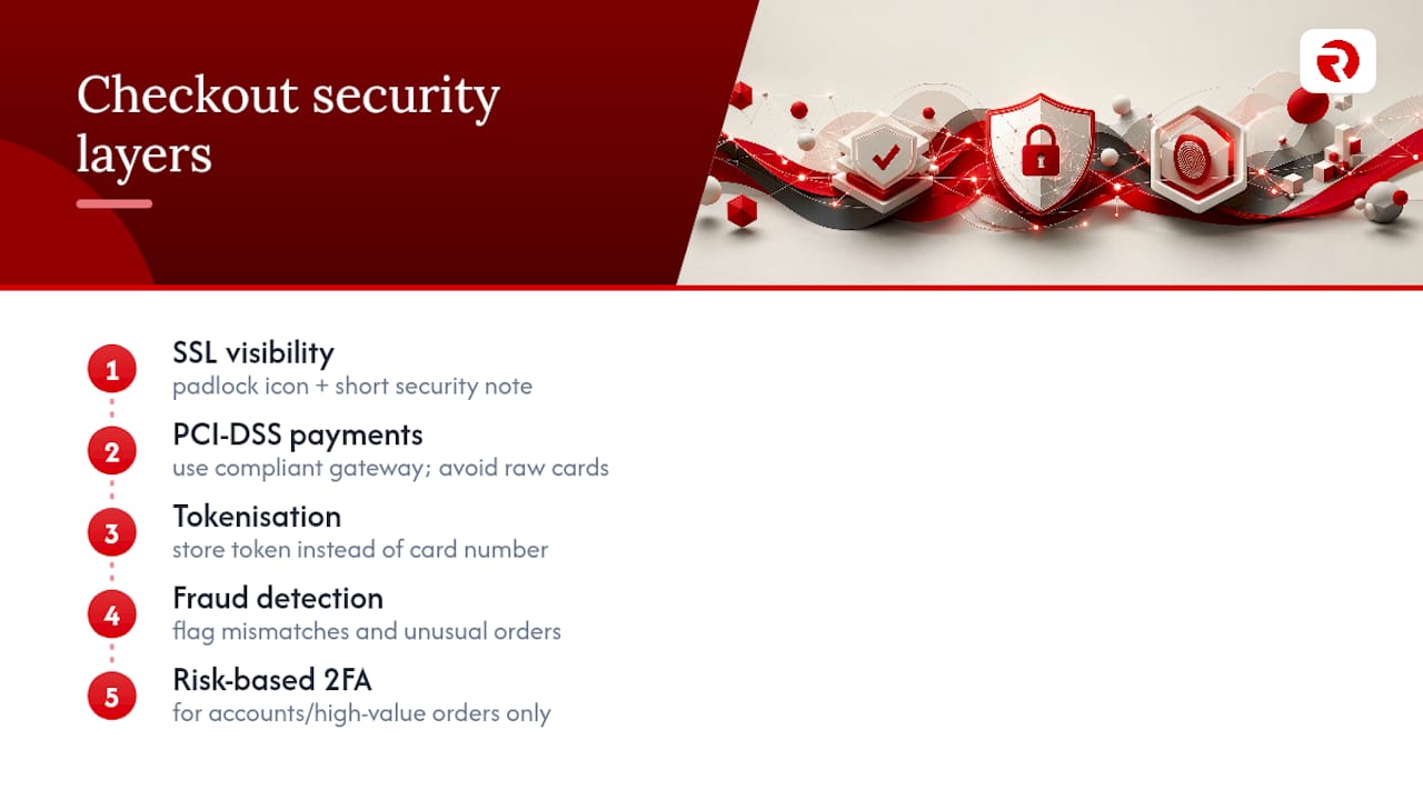
Tokenisation matters more than most merchants realise. Instead of storing a customer’s actual card number, a tokenised system stores a substitute reference, so even a data breach on your end exposes nothing usable. Pair this with fraud detection tools that flag unusual order patterns (mismatched billing and shipping addresses, unusually large first-time orders) without adding friction for legitimate shoppers.
Two-factor authentication makes sense for account-based purchases and high-value orders, but resist applying it to every guest checkout. Security measures that slow down a low-risk £20 purchase just reintroduce the friction you spent the rest of this article removing. The goal is layered protection that operates mostly invisibly, surfacing only when risk actually rises.
Personalisation techniques to tailor the checkout experience
Personalisation in checkout works best when it removes decisions rather than adding them. A returning customer should see their saved address and preferred payment method pre-filled, not a blank form identical to their first visit.
Order summaries can reflect purchase history usefully. A customer who has bought the same product twice before doesn’t need reassurance copy explaining what the product does. New customers, by contrast, benefit from a concise returns policy or guarantee line exactly where new-customer hesitation tends to surface, near the final payment button.
Geolocation-based personalisation extends this further. Showing delivery estimates, currency and tax treatment specific to the shopper’s location the moment they land on checkout, rather than after they submit an address, removes a layer of second-guessing before it starts.
Dynamic upsells belong here too, used sparingly. A relevant, low-friction add-on offered before payment (not after) can lift order value without adding a step, provided it doesn’t interrupt the flow toward completion. The line to watch is subtle: personalisation should feel like the checkout already knows what this customer needs, never like it is studying them.
Multi-currency and multi-language support for global customers
A checkout that shows prices in an unfamiliar currency or forces a foreign language on a shopper adds a mental tax most people won’t pay. If you sell beyond a single market, currency and language support belong in the core checkout optimisation plan, not as a later add-on.
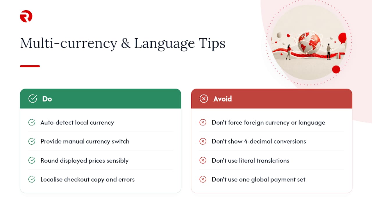
Display local currency automatically based on the shopper’s location, with the option to switch manually for anyone using a VPN or travelling. Round displayed prices sensibly for each currency rather than showing an ugly conversion with four decimal places. It looks unfinished and undermines trust at exactly the wrong moment.
Language localisation should extend past the product page and into checkout copy itself, error messages included. A shopper who gets a form validation error in a language they don’t fully read is far more likely to abandon than one who sees it in their own. For businesses working across UK and Eastern European markets specifically, bilingual checkout copy that reads naturally, rather than as a literal translation, makes a measurable difference to completion rates.
Payment method availability varies by region too. A wallet or local payment method common in one country may be unfamiliar or entirely unavailable in another, so your express payment options should reflect where your actual customers are, not a single default set copied across every market.
An editor’s take on getting your priorities right
Most checkout advice reads like a checklist of forty things to fix simultaneously. That is the wrong instinct, and it is usually driven by impatience rather than strategy. Prevention almost always beats recovery, and the evidence for that is stark: recovery flows convert a single-digit share of the people who receive them, while a well-targeted prevention fix like cost transparency touches every single visitor who reaches your checkout.
The temptation to redesign everything at once is the most expensive mistake I see. A full redesign might improve five things and quietly break two others, and you’ll never know which change did what. Run one variable at a time. Tie every test to checkout conversion rate and revenue per session, not vanity metrics like time on page, and let the data tell you what to build next rather than deciding upfront.
— Bart
Get expert help optimising your checkout
Testing checkout changes properly takes time most in-house teams don’t have spare, alongside the UX and development skill to build experiments without risking your live store. Full CRO audits can identify where a checkout is leaking revenue, followed by building and implementing A/B tests, from cost transparency changes through to express payment integrations, with reporting that shows what moved the needle and what didn’t.
A typical engagement starts with an audit of your current checkout funnel, moves into a prioritised testing roadmap, and finishes with implementation support from our UX and development team, so you’re not left with a report full of recommendations nobody has time to build. If your checkout hasn’t been properly tested in the last year, that gap is probably costing you more than an agency engagement would. Explore our services to see how a checkout audit fits alongside broader digital marketing support, or review our case studies for examples of results across other client work.
Sources
FAQ
Is a 12% conversion rate on a website good?
It depends heavily on industry and traffic quality, but for most ecommerce checkout flows specifically, conversion rates that high are well above typical benchmarks. Most stores should judge performance against their own historical checkout conversion rate rather than a single industry-wide figure.
How do you improve the checkout process?
Start with the three highest-impact fixes: show all costs before the final page, default to guest checkout with fewer form fields, and add express payment options tuned for mobile. Test each change individually and measure against checkout conversion rate and revenue per session.
Is SEO worth it for ecommerce?
SEO drives the qualified traffic that a well-optimised checkout then needs to convert, so the two work together rather than as alternatives. A store with strong SEO and a leaking checkout wastes much of that traffic, which is why agencies increasingly pair SEO and CRO work in the same engagement.
What does “checkout” mean?
Checkout is the final stage of an online purchase where a shopper enters delivery, payment and contact details to complete an order. Checkout optimisation is the process of removing friction from that stage to increase the share of visitors who finish it.
How many form fields should a checkout have?
An optimised checkout should aim for roughly 7 to 8 input fields, within a total of 12 to 14 form elements. Fewer fields, guest checkout by default and address autofill together can recover a meaningful share of otherwise abandoned revenue.